leo
leomak
mak
GEA
,
Interpretation, Motion
,
2026
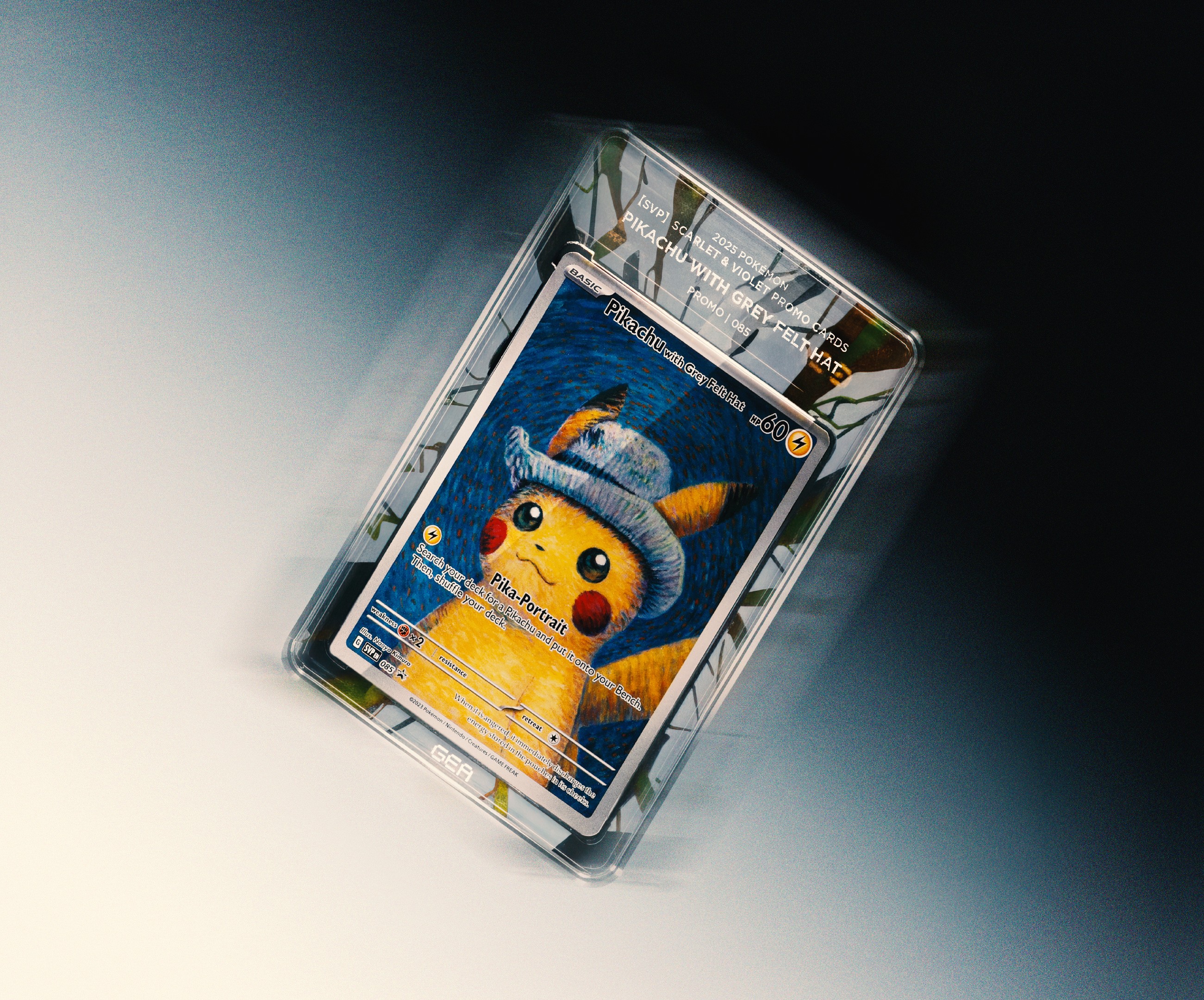
Grading Eleven Authentication (GEA), also known as Grading 11, is a Hong Kong-founded next-generation trading card grading company that launched in December 2025. Based in Hong Kong, GEA stands out by combining precise authentication with artistic slab design. Their premium slabs feature custom character- and trait-specific artwork, embedded NFC chips for instant smartphone verification, UV protection, and a compact form factor — turning the protective case into a collectible artwork itself. The brand targets both seasoned collectors and newer enthusiasts in the growing TCG market (Pokémon, One Piece, Disney Lorcana, etc.), positioning itself at the intersection of art, technology, and collectible culture. We interpreted and developed from limited branding materials to strongly reflect their unique selling point — elevating the grading slab into an artistic and innovative extension of the collectible. Through close collaboration with the client, we refined the visual direction based on their target audience strategy. By incorporating trendy visual elements, we helped position GEA as a next-gen, mature, and forward-thinking new card-grading brand, enhancing its market appeal and supporting brand expansion in the competitive collectibles industry. Director: Edward Chiu @edwardjohnsebastian @cement.werkstatt Brand Video, Teaser, Packaging, Photo Retouch: Leo Mak Logo, Typeface: Eva Tsang Videographer: Sky Li @li2chun Photographer: Jas @cheungwaishinjas Social Planner: Samantha @cement.werkstatt
gea-explainer.mp4
gea-brand-video-1.mp4

gea-grading-service-2.jpg
gea-brand-video-2.mp4
gea-generic-packaging.mp4

gea-generic-packaging-2.jpg
gea-brand-video-3.mp4
gea-mood-shot.jpg
gea-retouched-series.mp4
GEA
,
Interpretation, Motion
,
2026
Grading Eleven Authentication (GEA), also known as Grading 11, is a Hong Kong-founded next-generation trading card grading company that launched in December 2025. Based in Hong Kong, GEA stands out by combining precise authentication with artistic slab design. Their premium slabs feature custom character- and trait-specific artwork, embedded NFC chips for instant smartphone verification, UV protection, and a compact form factor — turning the protective case into a collectible artwork itself. The brand targets both seasoned collectors and newer enthusiasts in the growing TCG market (Pokémon, One Piece, Disney Lorcana, etc.), positioning itself at the intersection of art, technology, and collectible culture. We interpreted and developed from limited branding materials to strongly reflect their unique selling point — elevating the grading slab into an artistic and innovative extension of the collectible. Through close collaboration with the client, we refined the visual direction based on their target audience strategy. By incorporating trendy visual elements, we helped position GEA as a next-gen, mature, and forward-thinking new card-grading brand, enhancing its market appeal and supporting brand expansion in the competitive collectibles industry. Director: Edward Chiu @edwardjohnsebastian @cement.werkstatt Brand Video, Teaser, Packaging, Photo Retouch: Leo Mak Logo, Typeface: Eva Tsang Videographer: Sky Li @li2chun Photographer: Jas @cheungwaishinjas Social Planner: Samantha @cement.werkstatt
gea-explainer.mp4
gea-brand-video-1.mp4
gea-grading-service-2.jpg
gea-brand-video-2.mp4
gea-generic-packaging.mp4
gea-generic-packaging-2.jpg
gea-brand-video-3.mp4
gea-mood-shot.jpg
gea-retouched-series.mp4
Town Club
,
Identity, Type Design
,
2023
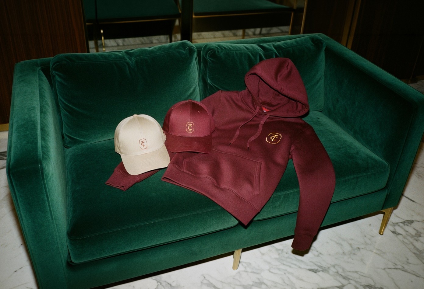
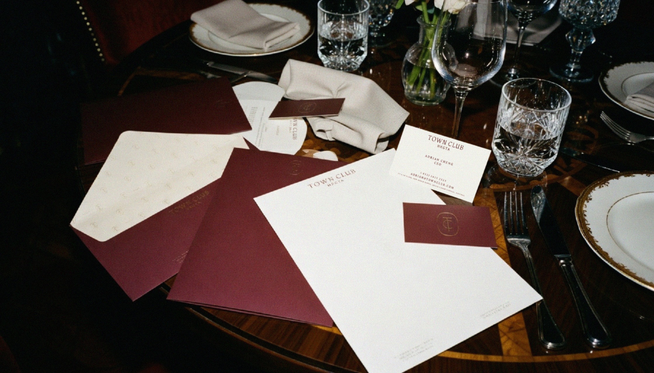
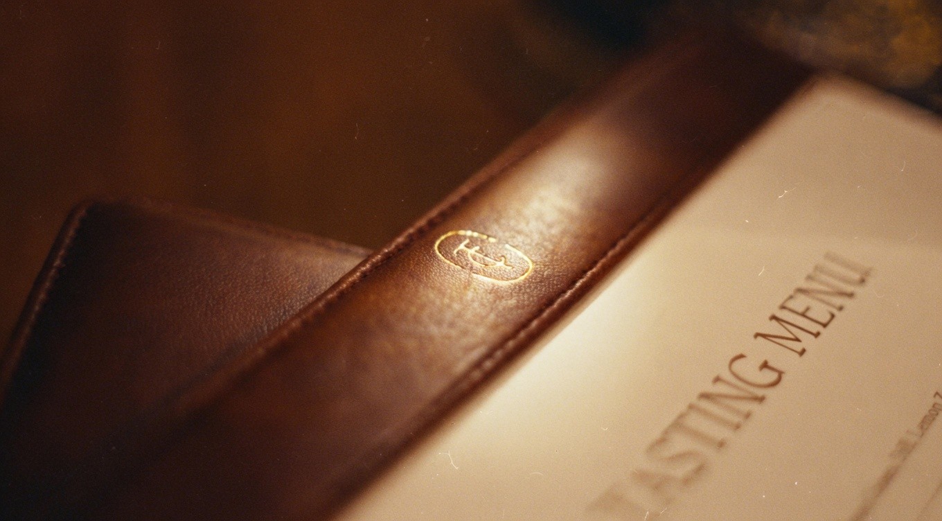
HKGTA Town Club is an exclusive private members’ club located in the heart of Central, Hong Kong. Situated on the top floors of New World Tower, the club spans approximately 18,000 square feet and serves as a sophisticated urban oasis for Hong Kong’s elite. Offering refined dining, world-class chefs, sommeliers and mixologists, private event spaces, and luxurious amenities, Town Club provides a discreet hideaway where business, social connections, and leisure seamlessly converge. By invitation only, it embodies understated luxury and exclusivity in the city’s bustling financial district. A comprehensive and easy-to-adapt branding guideline has been developed, used to cover applications from surface to in-depth usage, ensuring flexibility and consistency across all touchpoints. The highlight of the project was the creation from the identity to the bespoke typeface, which delivers a highly crafted, exclusive, and immersive visual experience for members and visitors. This custom typography strengthens the club’s sophisticated identity and enhances every interaction with a sense of refined craftsmanship. Director: Edward Chiu @edwardjohnsebastian @cement.werkstatt Identity, Bespoke Typeface: Leo Mak Other Designer: Son Mok @sonmok, Britney Lam @babelamlam
TC-concept.JPG
tc-overview-by-cement.werkstatt.mp4
accessories-mock-up.jpg
application-mockup.jpg
application-2.mp4
application-mockup-2.jpg
real-menu.jpg
Town Club
,
Identity, Type Design
,
2023
HKGTA Town Club is an exclusive private members’ club located in the heart of Central, Hong Kong. Situated on the top floors of New World Tower, the club spans approximately 18,000 square feet and serves as a sophisticated urban oasis for Hong Kong’s elite. Offering refined dining, world-class chefs, sommeliers and mixologists, private event spaces, and luxurious amenities, Town Club provides a discreet hideaway where business, social connections, and leisure seamlessly converge. By invitation only, it embodies understated luxury and exclusivity in the city’s bustling financial district. A comprehensive and easy-to-adapt branding guideline has been developed, used to cover applications from surface to in-depth usage, ensuring flexibility and consistency across all touchpoints. The highlight of the project was the creation from the identity to the bespoke typeface, which delivers a highly crafted, exclusive, and immersive visual experience for members and visitors. This custom typography strengthens the club’s sophisticated identity and enhances every interaction with a sense of refined craftsmanship. Director: Edward Chiu @edwardjohnsebastian @cement.werkstatt Identity, Bespoke Typeface: Leo Mak Other Designer: Son Mok @sonmok, Britney Lam @babelamlam
TC-concept.JPG
tc-overview-by-cement.werkstatt.mp4
accessories-mock-up.jpg
application-mockup.jpg
application-2.mp4
application-mockup-2.jpg
real-menu.jpg
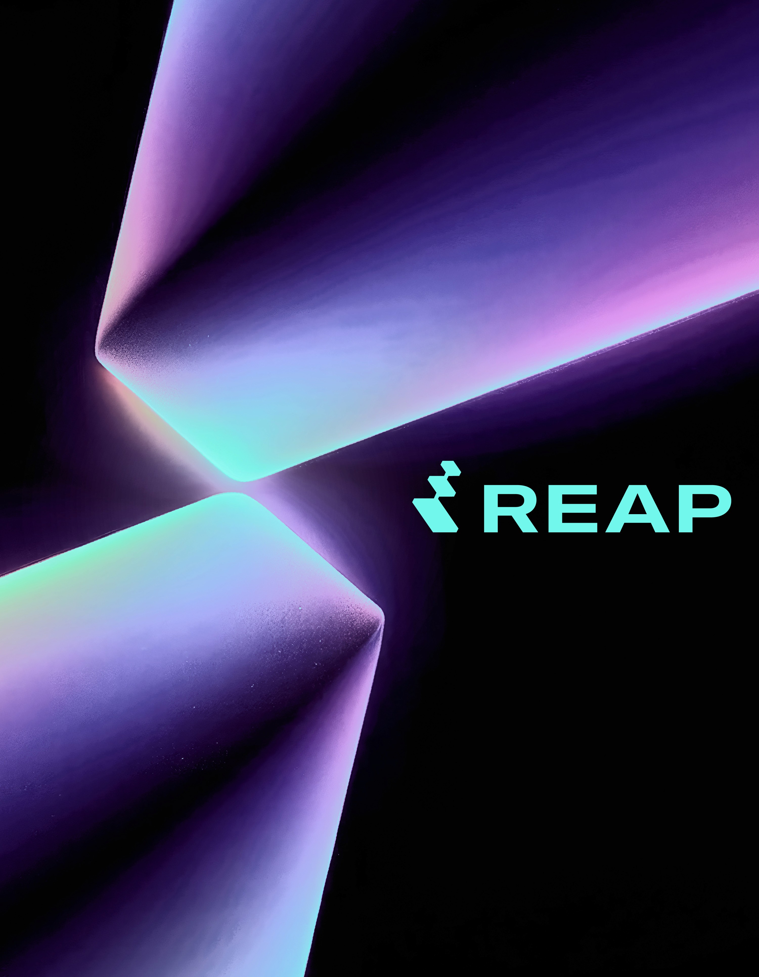
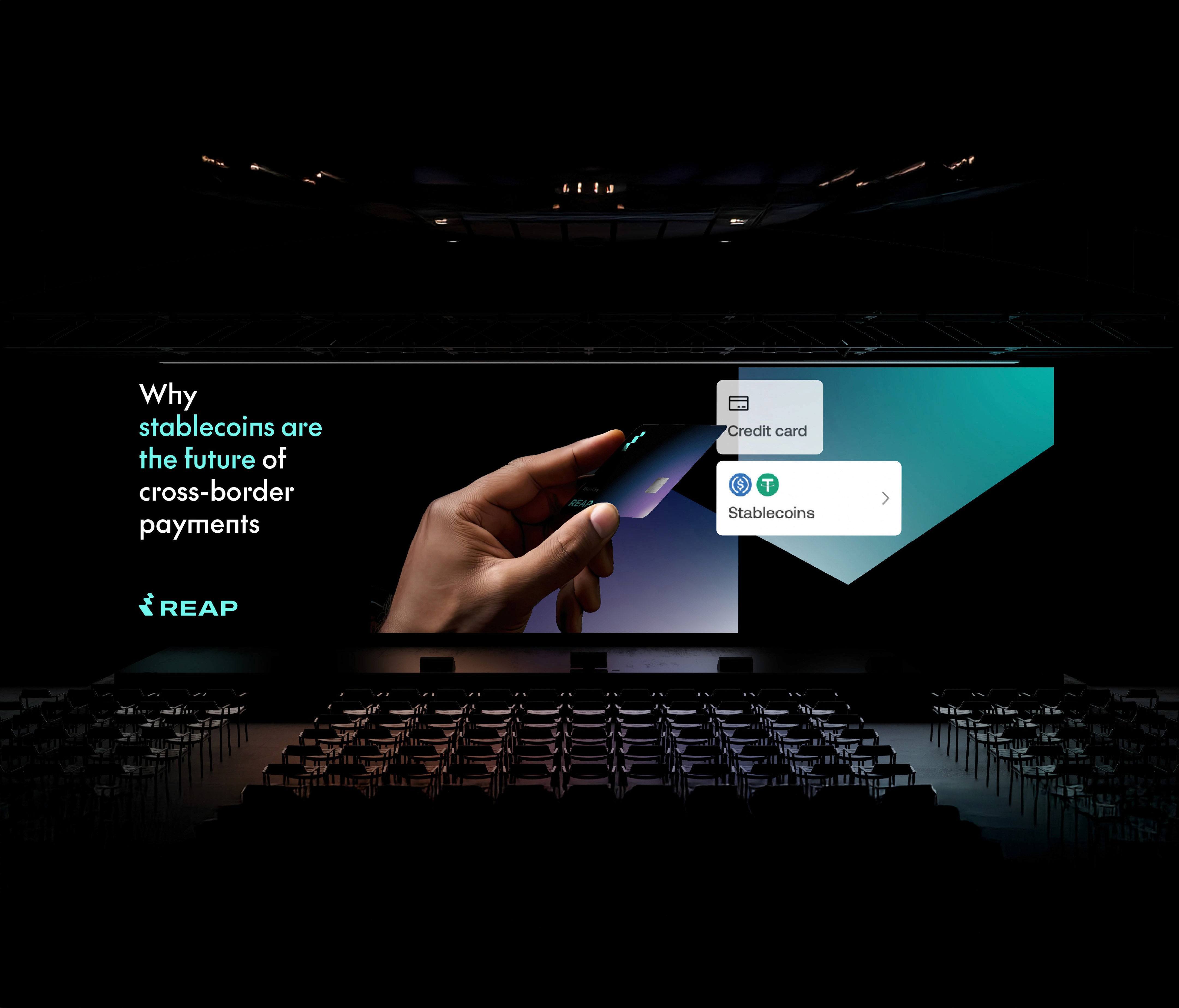
Reap Technologies
,
Identity, Motion
,
2025
Reap Technologies (Reap) is a Hong Kong-based fintech company founded in 2018. It delivers stablecoin-powered financial infrastructure that enables borderless payments and global financial connectivity for businesses worldwide. Reap offers innovative solutions, including Visa corporate credit cards (collateralised by fiat or USDC), expense management software, cross-border payouts, and embeddable finance APIs. Licensed in Hong Kong, Singapore, and Mexico, with strategic partnerships with Circle, Solana, and Visa, the company bridges traditional finance with digital assets — serving over 22,000 businesses, with a strong focus on Web3 and crypto-native enterprises. For Reap Technologies, we rebranded Reap with a more comprehensive and easy-to-adapt brand identity system — from surface-level applications through to in-depth usage. Designed with clear, intuitive logic that makes it simple to understand and implement, the identity ensures maximum flexibility while maintaining strong consistency across all practical and grounded applications. The creative direction focused on enhancing a strong technological, pioneering, and futuristic feel, moving away from an overly mature corporate aesthetic. This approach infuses the event with a fresh sense of innovation, accessibility, and transformation that better reflects Reap’s forward-thinking brand. Full Brand Video: www.vimeo.com/1005709098?fl=ip&fe=ec Official Website: www.reap.global Creative Direction: Leo Mak Website/Interpretation: In-house @Reap Technologies
concepts.jpg
concepts.mp4
app-opener.mp4
full-brand-identity.mp4
application.mp4
website-icon-interpreted-by-reap.mp4
teaser.mp4
full-teaser.mp4
at-louvre.mp4
stage.jpg
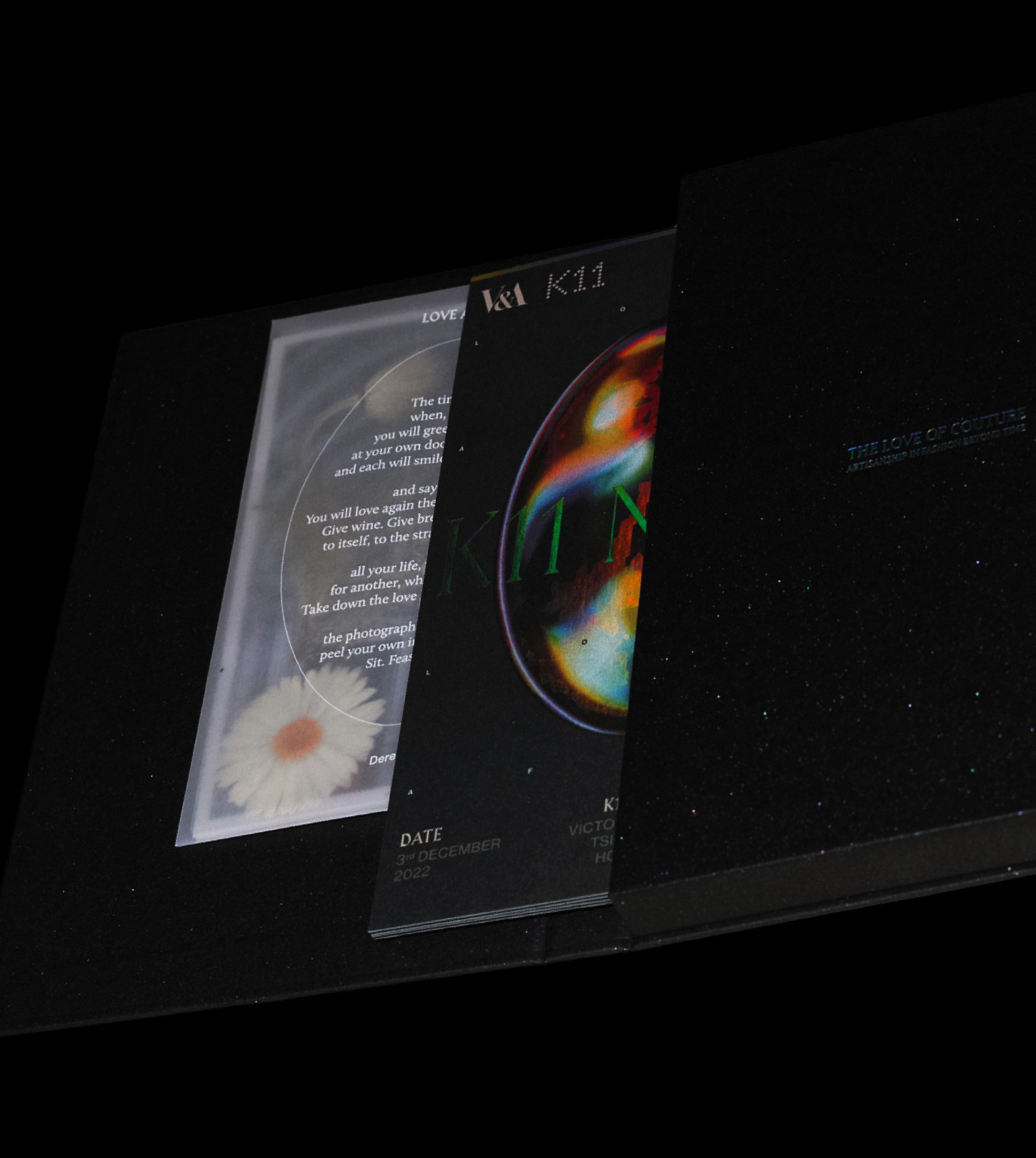
K11 Night 2022
,
Event, Identity
,
2022
K11 Night 2022 was the second edition of the prestigious annual flagship event hosted by K11 Concept (under K11 Group) at K11 MUSEA in Hong Kong. Held on 3 December 2022 at Victoria Dockside, the invitation-only gold-carpet gala marked the grand opening of the exhibition The Love of Couture: Artisanship in Fashion Beyond Time, curated in collaboration with London’s Victoria and Albert Museum (V&A). Chaired by Adrian Cheng with co-chairs William Chang Suk-ping and Tim Reeve (V&A), the star-studded evening — widely regarded as “Asia’s Met Gala” — brought together Hong Kong’s fashion elite, celebrities, and cultural influencers to celebrate haute couture and artisanal craftsmanship. For K11 Night 2022 by K11 Concept, we developed a comprehensive and easy-to-adapt event identity system — from surface-level applications through to in-depth usage. Designed with clear, intuitive logic that makes it simple to understand and implement, the identity ensures maximum flexibility while maintaining strong consistency across all practical and grounded applications. Particular emphasis was placed on evoking a powerful sense of invitation and privilege, creating an exclusive yet welcoming atmosphere that made every invited guest feel personally valued and immersed in the event’s refined prestige. Director: Edward Chiu @edwardjohnsebastian @cement.werkstatt Art Direction, Motion: Leo Mak Printing: Pixel Printing
lock-up-concepts.mp4
process.mp4
final-animated.mp4
side-exhibition.mp4
invitation-packaging-1.jpg
invitation-packaging-2.jpg
invitation-packaging-3.jpg
invitation-packaging-4.mp4
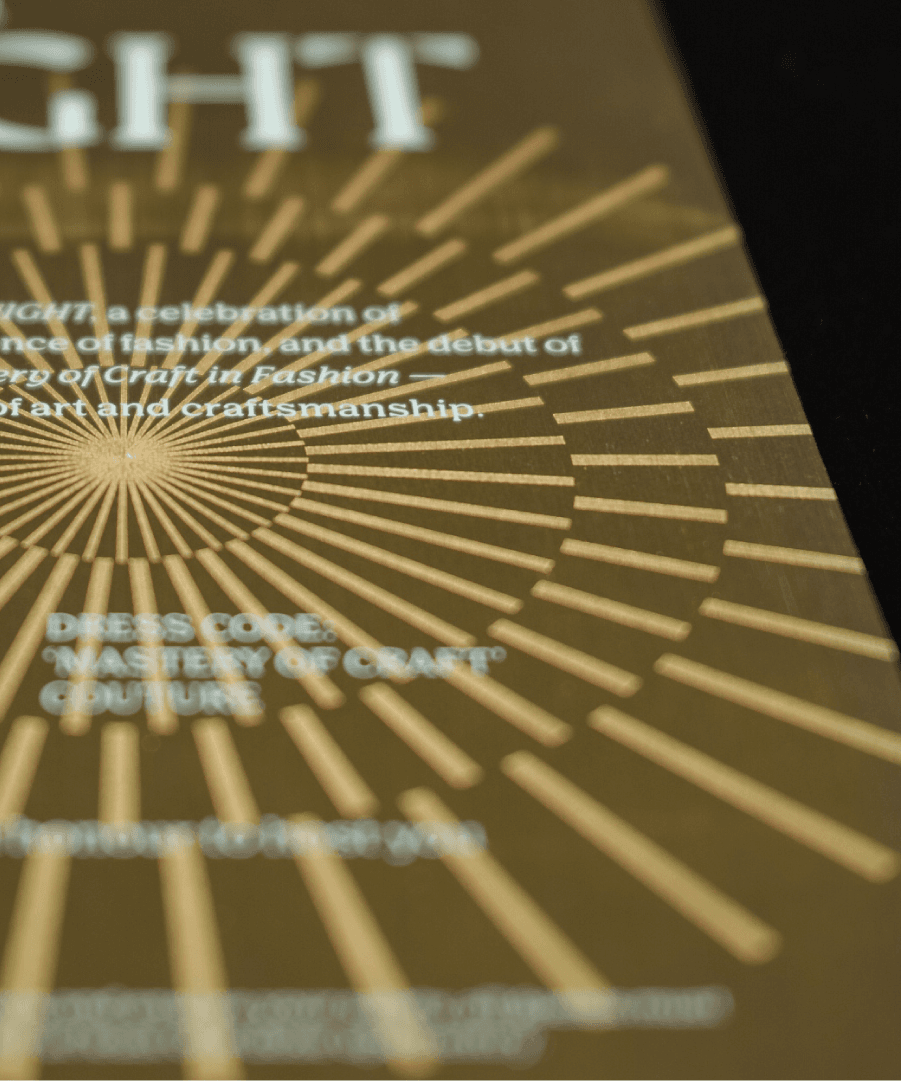
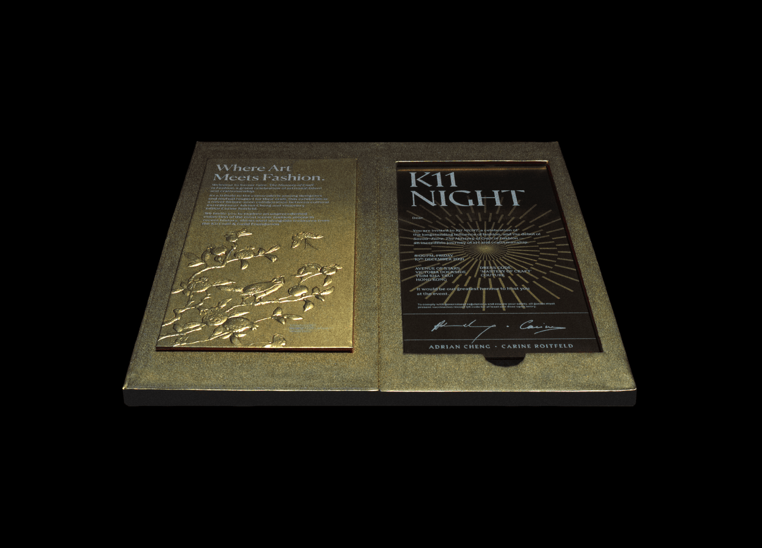
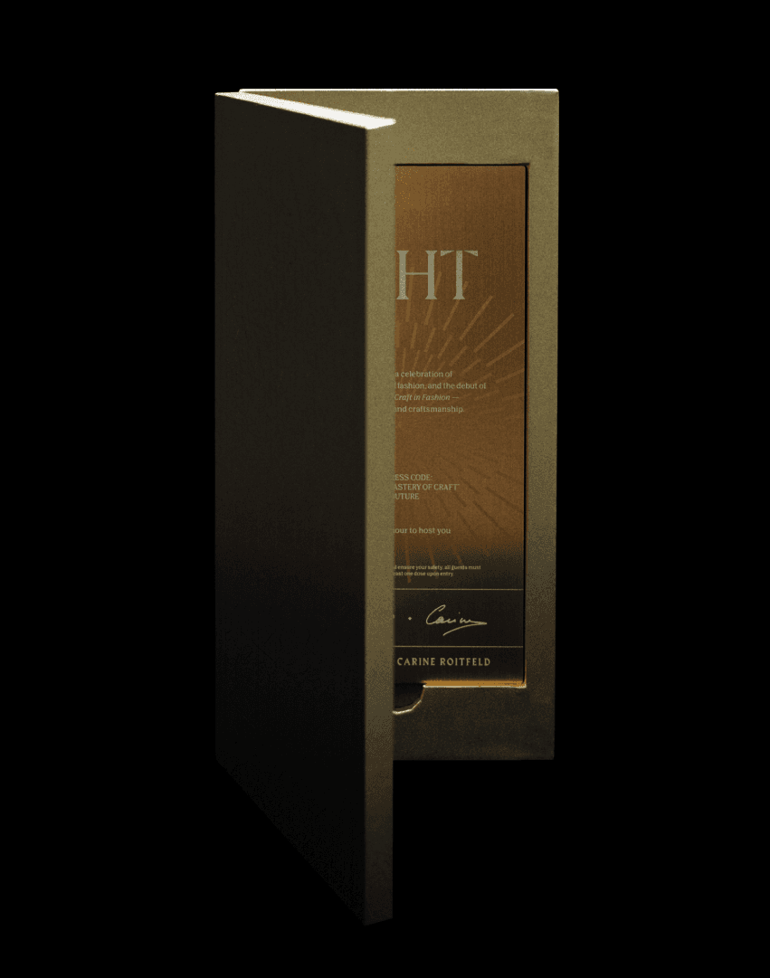
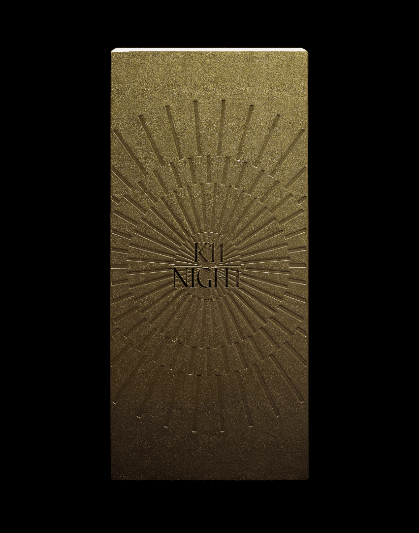
K11 Night 2021
,
Event, Identity
,
2021
K11 Night 2021 was a glamorous flagship event hosted by K11 Concept (under K11 Group) at K11 MUSEA in Hong Kong. Held in December 2021 on the promenade of Victoria Dockside, the event celebrated the launch of Asia’s first multi-brand fashion exhibition Savoir-Faire: The Mastery of Craft in Fashion, curated in collaboration with Carine Roitfeld. It featured a star-studded gold carpet, live performances, a Star Stage showcasing Hong Kong’s new creative talents, and attracted celebrities, socialites, and the city’s fashion elite. As a signature annual event of K11 — Hong Kong’s pioneering art-and-culture retail brand — K11 Night embodies the group’s vision of blending art, fashion, culture, and commerce. For K11 Night 2021 under K11 Concept, we developed a comprehensive and easy-to-adapt event identity — covering applications from surface level to in-depth usage. The guideline was designed with clear, intuitive logic that makes it simple to understand and implement, ensuring maximum flexibility while maintaining strong consistency across all event touchpoints and grounded applications. Director: Edward Chiu @edwardjohnsebastian @cement.werkstatt Art Direction, Motion: Leo Mak Printing: Champion Production
lock-up.mp4

lock-up-2.jpg
element-adapted.jpg
event-overview-by-in-house.mp4
invitation-packaging.jpg

invitation-packaging-2.jpg
invitation-packaging-3.jpg
invitation-packaging-4.jpg
invitation-packaging-5.jpg
invitation-packaging-6.jpg
K11 Night 2021
,
Event, Identity
,
2021
K11 Night 2021 was a glamorous flagship event hosted by K11 Concept (under K11 Group) at K11 MUSEA in Hong Kong. Held in December 2021 on the promenade of Victoria Dockside, the event celebrated the launch of Asia’s first multi-brand fashion exhibition Savoir-Faire: The Mastery of Craft in Fashion, curated in collaboration with Carine Roitfeld. It featured a star-studded gold carpet, live performances, a Star Stage showcasing Hong Kong’s new creative talents, and attracted celebrities, socialites, and the city’s fashion elite. As a signature annual event of K11 — Hong Kong’s pioneering art-and-culture retail brand — K11 Night embodies the group’s vision of blending art, fashion, culture, and commerce. For K11 Night 2021 under K11 Concept, we developed a comprehensive and easy-to-adapt event identity — covering applications from surface level to in-depth usage. The guideline was designed with clear, intuitive logic that makes it simple to understand and implement, ensuring maximum flexibility while maintaining strong consistency across all event touchpoints and grounded applications. Director: Edward Chiu @edwardjohnsebastian @cement.werkstatt Art Direction, Motion: Leo Mak Printing: Champion Production
lock-up.mp4
lock-up-2.jpg
element-adapted.jpg
event-overview-by-in-house.mp4
invitation-packaging.jpg
invitation-packaging-2.jpg
invitation-packaging-3.jpg
invitation-packaging-4.jpg
invitation-packaging-5.jpg
invitation-packaging-6.jpg
M+ Restored
,
Identity, Poster
,
2024
M+ Restored is a flagship film restoration initiative by M+, Asia’s global museum of contemporary visual culture in Hong Kong’s West Kowloon Cultural District. Launched in July 2023 as a three-year partnership with CHANEL, the program is dedicated to preserving and presenting nine landmark Hong Kong feature films. With a strong focus on the Hong Kong New Wave cinema that emerged in 1979, M+ Restored highlights the era’s creative experimentation and technical innovation, bringing restored classics back to the big screen for both local and international audiences through curated screenings and related programming. Simple brand identity and a series of promotional posters have been developed consistently. The creative direction focused on enhancing the sense of professional film restoration, refined high-end cinematic taste, and a sophisticated aesthetic that resonates with a Western/international audience perspective. This resulted in an elegant, timeless visual language that conveys prestige, artistry, and cultural depth while positioning the restored films as premium cinematic experiences that honour their historical and artistic significance. Creative, Art Direction: Leo Mak
system-logo-explainer.mp4
system-logo-explainer-2.mp4
postcard-set.mp4
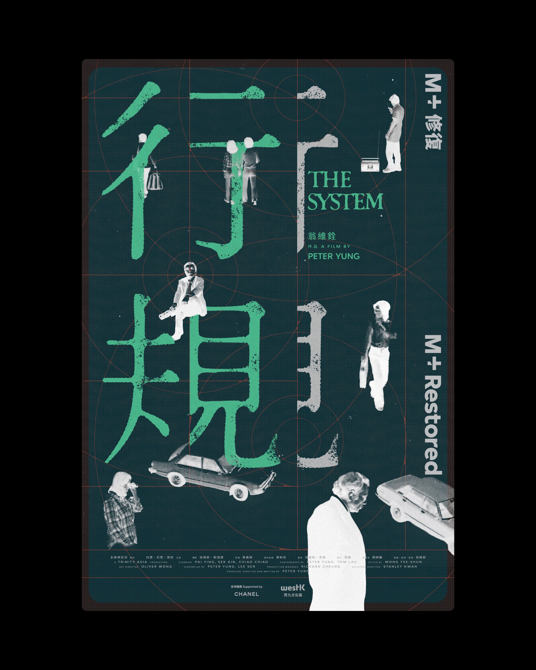
the-system-movie-poster.jpg
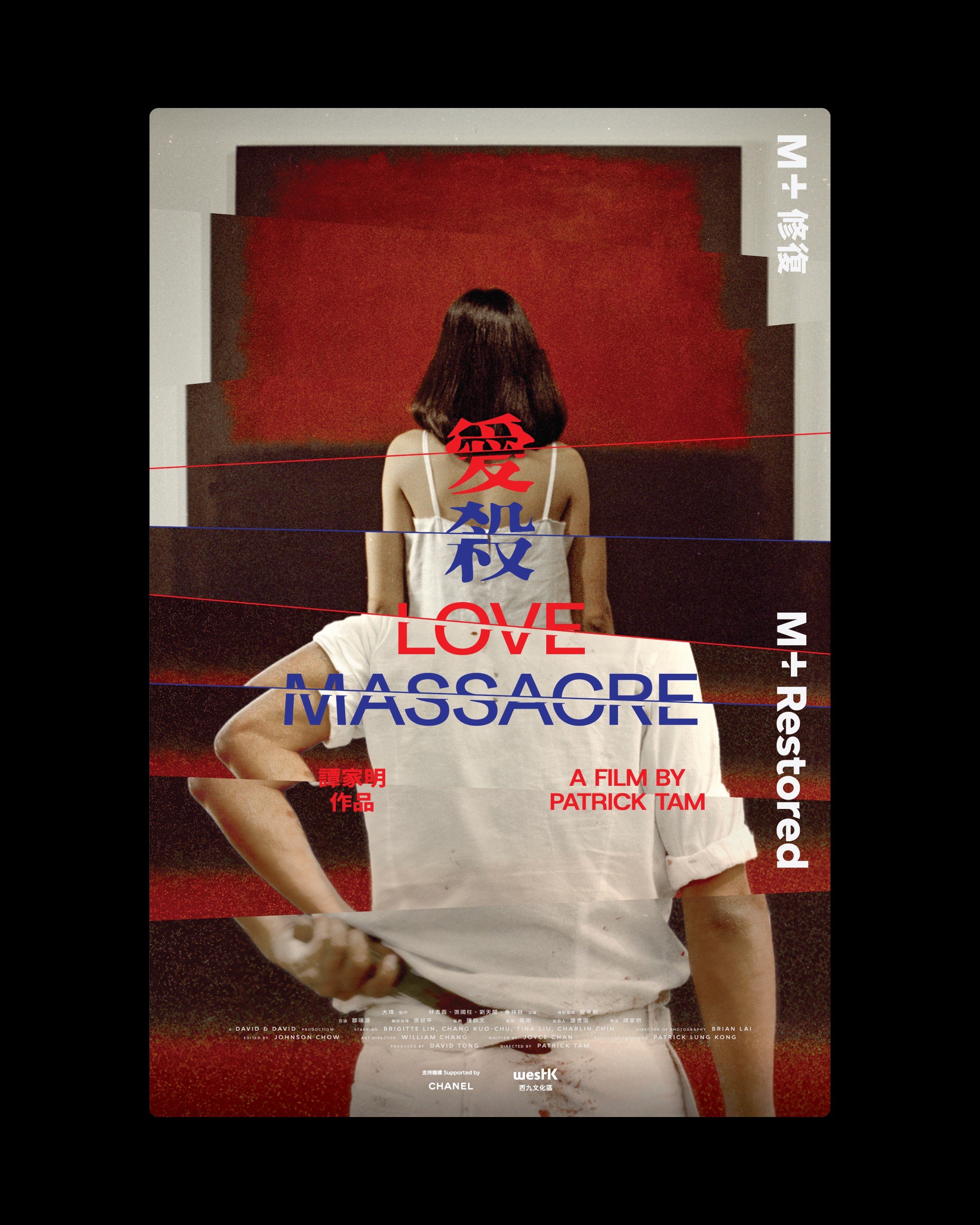
love-massacre-movie-poster.jpg
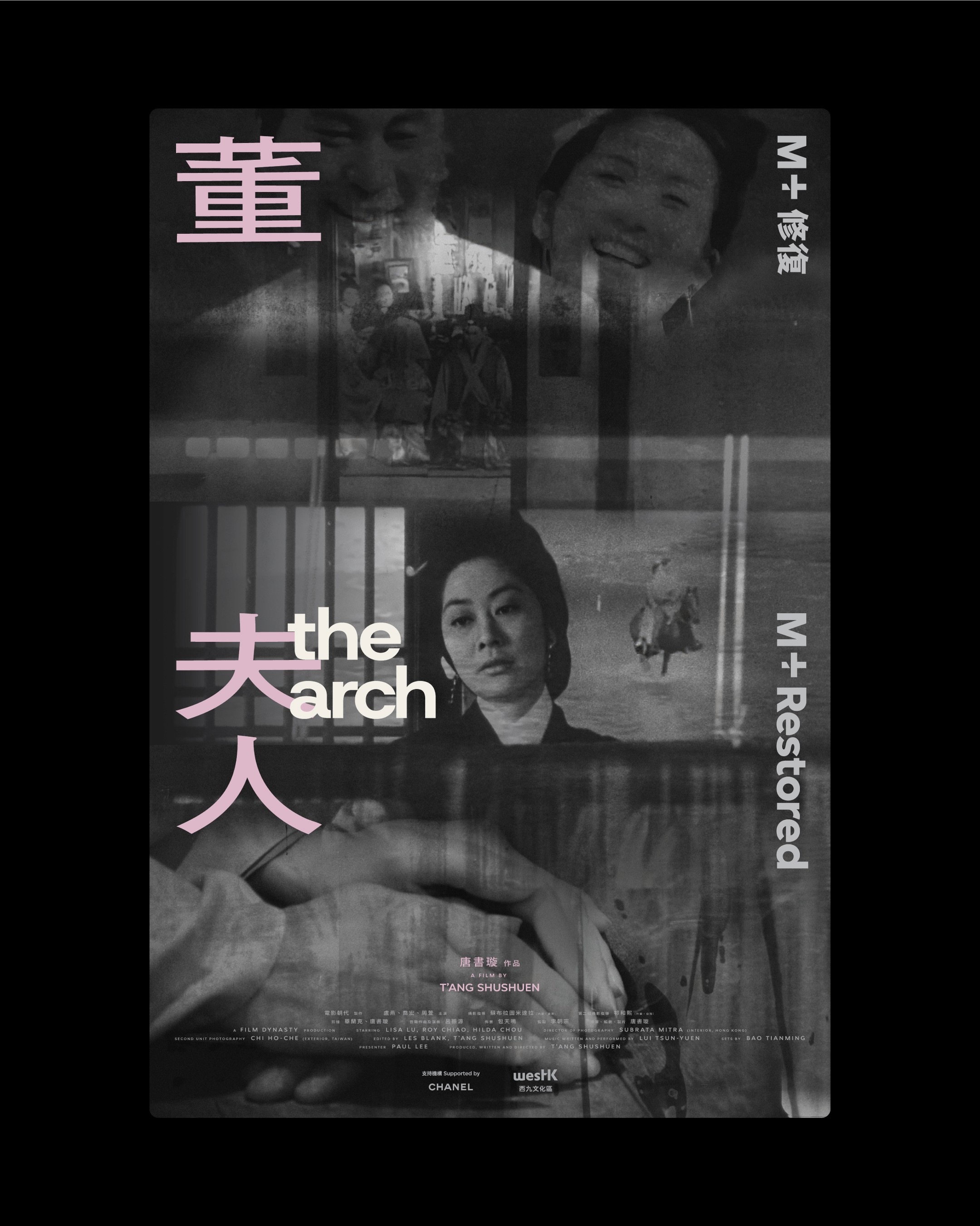
the-arch-movie-poster.jpg
M+ Restored
,
Identity, Poster
,
2024
M+ Restored is a flagship film restoration initiative by M+, Asia’s global museum of contemporary visual culture in Hong Kong’s West Kowloon Cultural District. Launched in July 2023 as a three-year partnership with CHANEL, the program is dedicated to preserving and presenting nine landmark Hong Kong feature films. With a strong focus on the Hong Kong New Wave cinema that emerged in 1979, M+ Restored highlights the era’s creative experimentation and technical innovation, bringing restored classics back to the big screen for both local and international audiences through curated screenings and related programming. Simple brand identity and a series of promotional posters have been developed consistently. The creative direction focused on enhancing the sense of professional film restoration, refined high-end cinematic taste, and a sophisticated aesthetic that resonates with a Western/international audience perspective. This resulted in an elegant, timeless visual language that conveys prestige, artistry, and cultural depth while positioning the restored films as premium cinematic experiences that honour their historical and artistic significance. Creative, Art Direction: Leo Mak
system-logo-explainer.mp4
system-logo-explainer-2.mp4
postcard-set.mp4
the-system-movie-poster.jpg
love-massacre-movie-poster.jpg
the-arch-movie-poster.jpg
HKPhil's 50th
,
Identity
,
2024
In the 2023/24 season, HK Phil celebrated its Golden Jubilee — the 50th Anniversary of its professional era — under the theme “Rhythm of the City”. The year-long celebration included landmark concerts such as the Symphonic Reunion at the Hong Kong Coliseum, the 50th Anniversary Gala Dinner at Regent Hong Kong, community performances, special publications, and collaborative merchandise, honouring the orchestra’s rich history while reinforcing its role as a cultural ambassador for Hong Kong. The creative direction focused on enhancing a powerful sense of jubilee, professionalism, history, and maturity, creating a refined visual language that honours the orchestra’s legacy while evoking prestige and timeless elegance. Full Event Teaser: vimeo.com/1003678452 Creative, Art Direction: Leo Mak
explainer.mp4
book-go-through.mp4
event-overview.mp4
teaser.mp4
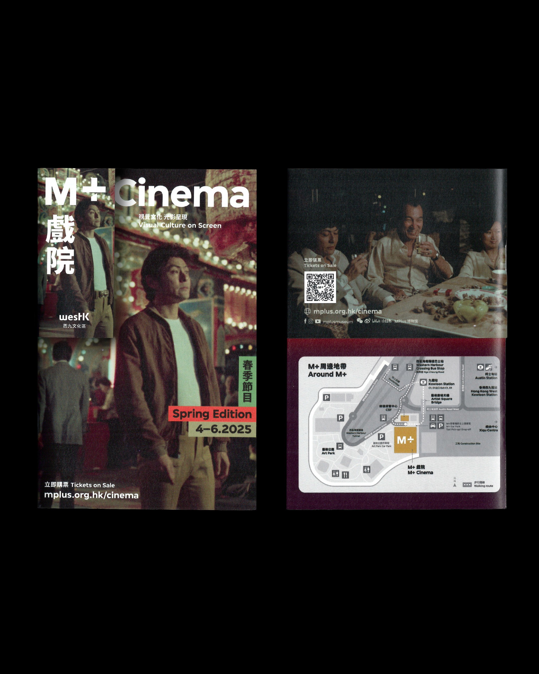
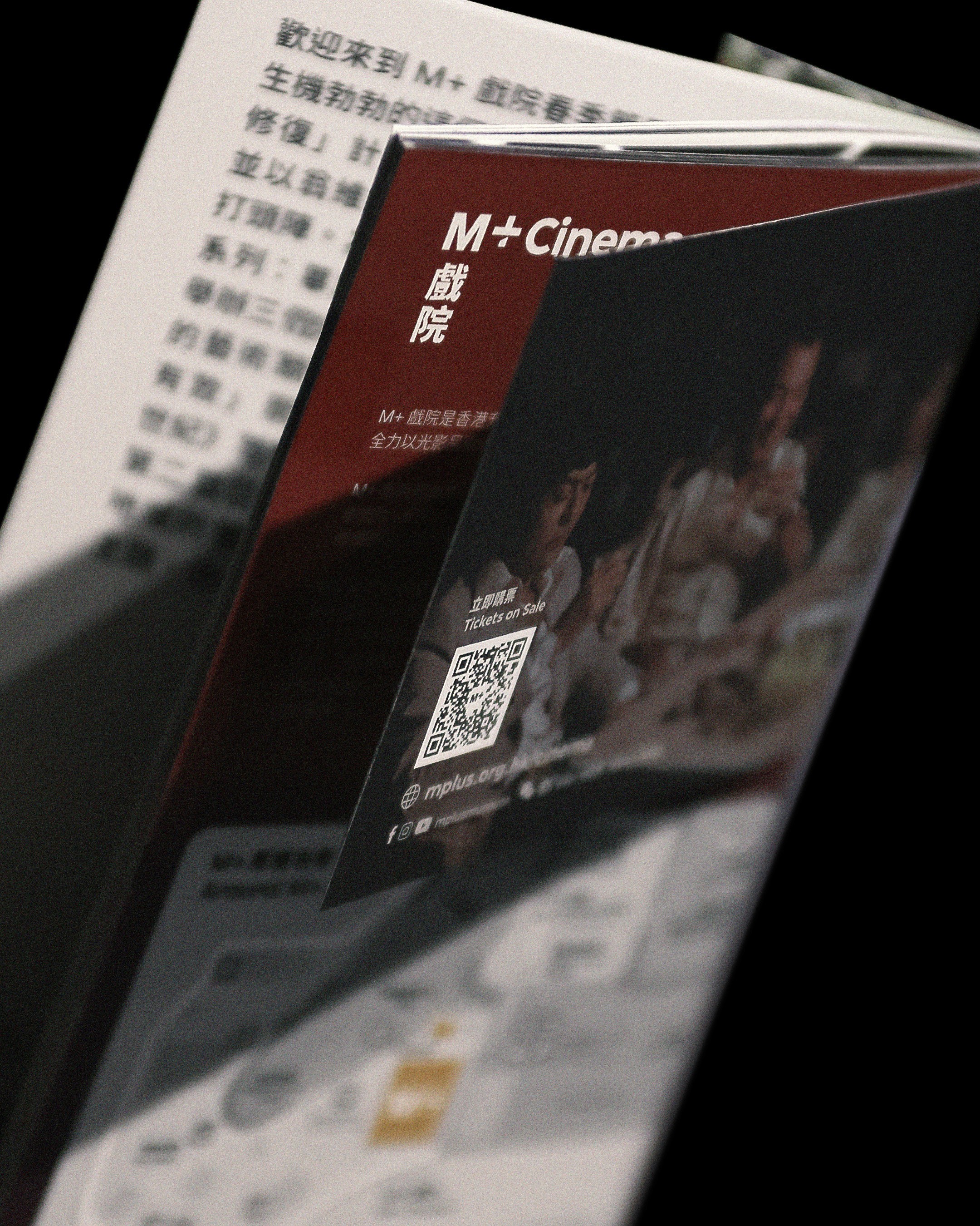
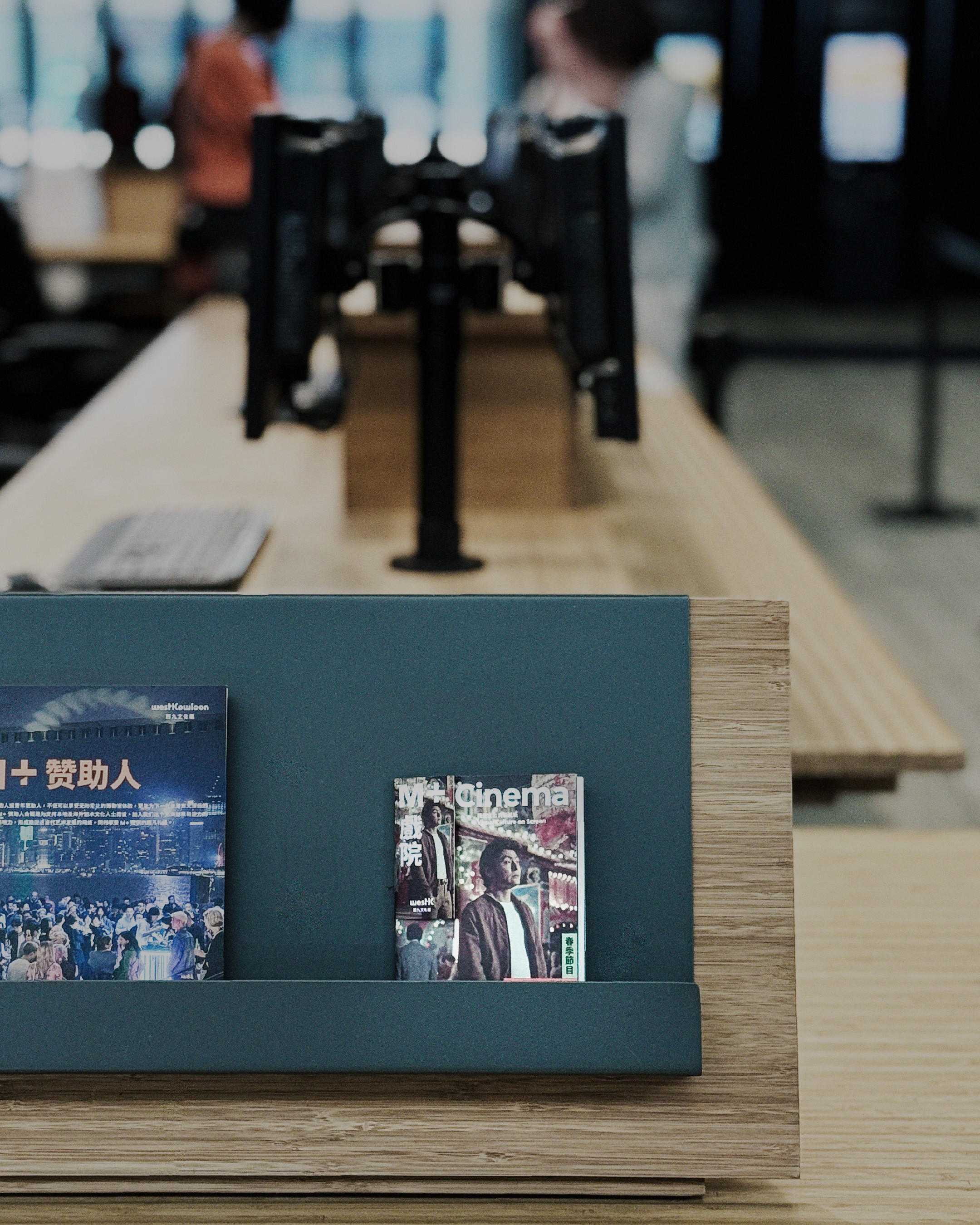
M+ Cinema
,
Identity, Publication
,
2024
M+ Cinema is the dedicated in-house cinema of M+, Asia’s global museum of contemporary visual culture, located in Hong Kong’s West Kowloon Cultural District. Opened in June 2022 as the centrepiece of the museum’s Moving Image Centre, it features three state-of-the-art screening theatres and presents a sophisticated, cross-disciplinary programme of feature films, documentaries, experimental cinema, video art, restored classics, and rare titles. With seasonal editions released quarterly, M+ Cinema has established itself as Hong Kong’s premier destination for high-calibre, thought-provoking moving-image experiences that bridge contemporary visual culture with serious film programming. We interpreted the brand identity which strongly linked to M+ and designed the quarterly booklet (seasonal programme guide). The creative direction focused on enhancing the sense and feel of professional film screening, refined high-end cinematic taste, and a sophisticated aesthetic that resonates strongly with a Western/international audience perspective. This resulted in an elegant, timeless visual language that conveys prestige, artistry, and cultural depth while positioning M+ Cinema as a world-class venue for discerning cinephiles. Creative, Art Direction: Leo Mak

cover.jpg
cover-back.jpg
book-go-through.mp4
close-up-back.jpg
on-site.jpg
M+ Cinema
,
Identity, Publication
,
2024
M+ Cinema is the dedicated in-house cinema of M+, Asia’s global museum of contemporary visual culture, located in Hong Kong’s West Kowloon Cultural District. Opened in June 2022 as the centrepiece of the museum’s Moving Image Centre, it features three state-of-the-art screening theatres and presents a sophisticated, cross-disciplinary programme of feature films, documentaries, experimental cinema, video art, restored classics, and rare titles. With seasonal editions released quarterly, M+ Cinema has established itself as Hong Kong’s premier destination for high-calibre, thought-provoking moving-image experiences that bridge contemporary visual culture with serious film programming. We interpreted the brand identity which strongly linked to M+ and designed the quarterly booklet (seasonal programme guide). The creative direction focused on enhancing the sense and feel of professional film screening, refined high-end cinematic taste, and a sophisticated aesthetic that resonates strongly with a Western/international audience perspective. This resulted in an elegant, timeless visual language that conveys prestige, artistry, and cultural depth while positioning M+ Cinema as a world-class venue for discerning cinephiles. Creative, Art Direction: Leo Mak
cover.jpg
cover-back.jpg
book-go-through.mp4
close-up-back.jpg
on-site.jpg
Artazine
,
Identity, Website
,
2022
Artazine (ARTAZINE), “The Progressive Voice in Art, Culture and the Future,” is a digital editorial platform established in 2022 by ARTA TechFin, a Hong Kong-listed fintech company. Positioned as a sophisticated online destination, Artazine bridges traditional art, contemporary culture, and emerging Web3 technologies — including NFTs, crypto, gaming, and the metaverse — delivering exclusive stories and insights that explore how these developments are empowering global creators and shaping the future of cultural commerce. For Artazine, we developed a mid-scale brand identity. The creative direction focused on enhancing a high-end, artistic feel while effectively bridging traditional and modern digital art through the visual language. This resulted in a sophisticated and refined aesthetic that seamlessly connects classical artistic heritage with forward-thinking digital innovation, conveying prestige, cultural depth, and progressive creativity. Director: Edward Chiu @edwardjohnsebastian @cement.werkstatt Website Wireframe, Motion, Logo: Leo Mak Art Direction: Leo Mak, Joey Lo Website: Keysoc
logo-generic-motion.mp4
fast-brand-identity.mp4
web-wireframe.jpg
mobile-opener.mp4
web-final.mp4
final-teaser.mp4
bc sunday
,
Identity
,
2023
bcSunday is the long-running signature Sunday screening programme presented by Broadway Cinematheque (BC), Hong Kong’s premier arthouse cinema located in Yau Ma Tei. As a dedicated weekly platform for cinephiles, bcSunday curates and presents independent, experimental, international, and niche films that sit outside mainstream commercial cinema, offering thoughtful and unconventional moving-image experiences in an intimate cinema setting. For the bcSunday programme by Broadway Cinematheque, we developed a simple and cohesive brand identity along with supporting promotional materials. The creative direction focused on enhancing the grounded, experimental, and distinctly niche feel of the film selections and screenings. This resulted in an authentic, understated visual language that reflects the programme’s independent spirit and strong appeal to discerning cinephiles. Creative, Art Direction: Leo Mak
template-explainer.mp4
grid-post-system.mp4
LUCA_03.JPG
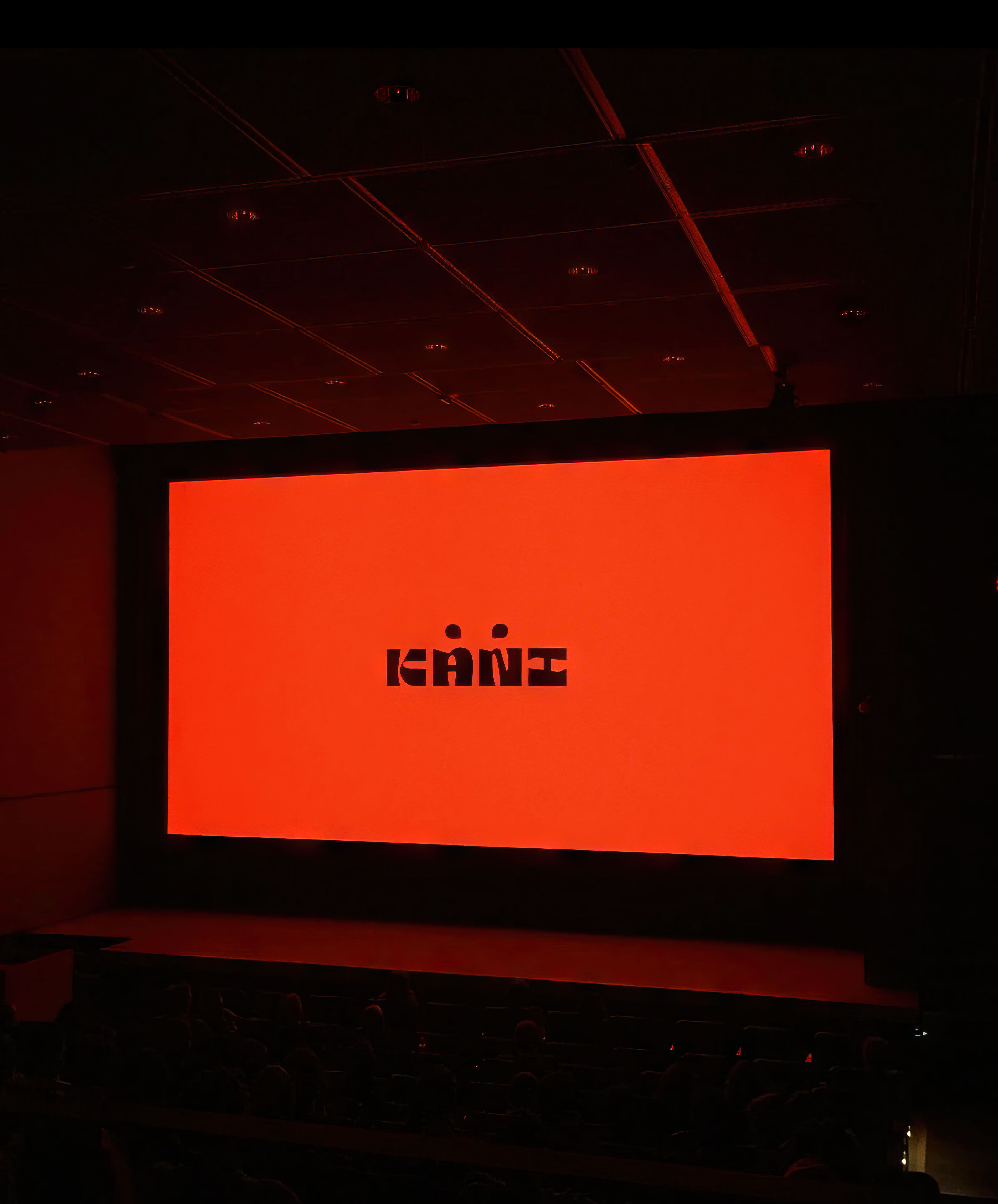
KANI Releasing
,
Identity
,
2021
Kani Releasing is a boutique film distributor and home-video label founded in 2021 by Ariel Esteban Cayer and Pearl Chan. Based in Hong Kong but primarily serving the North American market, the company is dedicated to Asian and East Asian cinema — specialising in independent, experimental, and niche titles ranging from contemporary works to restored repertory classics. Named after Yasujiro Ozu’s custom tatami-level tripod, Kani Releasing aims to “level the gaze” by presenting culturally authentic films with rich contextual materials through high-quality Blu-ray editions and selective theatrical releases. For Kani Releasing, we developed a mid-scale brand identity and supporting promotional materials. The creative direction focused on enhancing the experimental and distinctly niche feel of their carefully curated film picks and screenings. This resulted in an authentic and refined visual language that reflects the company’s deep commitment to independent, artistic, and unconventional cinema. Creative, Art Direction: Leo Mak
logo-on-screen.jpg

crab-typography.gif

logo-explainer.gif
full-film-opener.mp4
logo-on-box-final.mp4
KANI Releasing
,
Identity
,
2021
Kani Releasing is a boutique film distributor and home-video label founded in 2021 by Ariel Esteban Cayer and Pearl Chan. Based in Hong Kong but primarily serving the North American market, the company is dedicated to Asian and East Asian cinema — specialising in independent, experimental, and niche titles ranging from contemporary works to restored repertory classics. Named after Yasujiro Ozu’s custom tatami-level tripod, Kani Releasing aims to “level the gaze” by presenting culturally authentic films with rich contextual materials through high-quality Blu-ray editions and selective theatrical releases. For Kani Releasing, we developed a mid-scale brand identity and supporting promotional materials. The creative direction focused on enhancing the experimental and distinctly niche feel of their carefully curated film picks and screenings. This resulted in an authentic and refined visual language that reflects the company’s deep commitment to independent, artistic, and unconventional cinema. Creative, Art Direction: Leo Mak
logo-on-screen.jpg
crab-typography.gif
logo-explainer.gif
full-film-opener.mp4
logo-on-box-final.mp4
Happy Printing Co.
,
Identity
,
2026
Happy Printing Company (快樂印刷公司) is a historic letterpress workshop located at 17 Pok Man Street, Tai Kok Tsui, Hong Kong. Established in 1977 by Mr. Kwan Wing-cheuk and his wife, it was one of the last traditional movable-type printing businesses in the city. For nearly 50 years, the family-run shop specialised in hand-setting metal type to produce business cards, receipts, posters and commercial print materials — preserving a rare craft that dates back to Hong Kong’s industrial golden era. The workshop gained cultural recognition as a living heritage icon before closing in September 2025 upon the owners’ retirement. To turn Happy Printing Co. into a new-generation, select shop/artspace, we developed a comprehensive, easy-to-adapt branding guideline covering applications from surface-level to in-depth use. Designed with clear, intuitive logic, the guideline is simple to understand and implement, ensuring maximum flexibility while maintaining strong consistency across all practical and grounded brand applications. Creative Direction: Leo Mak

minimised-logo.jpg
logo-element-variation.mp4
application.mp4
full-brand-identity.mp4
Happy Printing Co.
,
Identity
,
2026
Happy Printing Company (快樂印刷公司) is a historic letterpress workshop located at 17 Pok Man Street, Tai Kok Tsui, Hong Kong. Established in 1977 by Mr. Kwan Wing-cheuk and his wife, it was one of the last traditional movable-type printing businesses in the city. For nearly 50 years, the family-run shop specialised in hand-setting metal type to produce business cards, receipts, posters and commercial print materials — preserving a rare craft that dates back to Hong Kong’s industrial golden era. The workshop gained cultural recognition as a living heritage icon before closing in September 2025 upon the owners’ retirement. To turn Happy Printing Co. into a new-generation, select shop/artspace, we developed a comprehensive, easy-to-adapt branding guideline covering applications from surface-level to in-depth use. Designed with clear, intuitive logic, the guideline is simple to understand and implement, ensuring maximum flexibility while maintaining strong consistency across all practical and grounded brand applications. Creative Direction: Leo Mak
minimised-logo.jpg
logo-element-variation.mp4
application.mp4
full-brand-identity.mp4
Gently Rebellious— Wilson Yip Retrospective
,
Event Identity, Publication
,
2024
"Gently Rebellious — Wilson Yip Retrospective" (爆裂小念頭──葉偉信電影回顧展) was a film retrospective presented by the Hong Kong Film Critics Society from 20 January to 4 February 2024 at Broadway Cinematheque and Premiere Elements. The programme featured ten feature films by acclaimed Hong Kong director Wilson Yip (葉偉信), celebrating his distinctive, rule-breaking approach to cinema — from early offbeat comedies and genre experiments to his later mainstream successes such as the Ip Man series. For the "Gently Rebellious — Wilson Yip Retrospective" presented by the Hong Kong Film Critics Society, we developed the mid-scale event identity and designed the official brochure. The creative direction focused on enhancing the grounded, experimental, and rebellious feel of Wilson Yip’s unique filmmaking style. This resulted in a cohesive visual language that authentically captures his unconventional spirit, independent edge, and creative non-conformity within Hong Kong cinema. Creative, Art Direction: Leo Mak
design-overview.mp4
booklet.gif
event-overview.mp4
A Collection in Two Acts
,
Event Identity, Poster
,
2022
"A Collection in Two Acts" (also referred to as Yuri in 2 Acts) was a mid-scale group exhibition presented by Rossi & Rossi at their Hong Kong gallery in Wong Chuk Hang from 16 July to 16 September 2022. Curated by independent curator Chris Wan, the exhibition drew exclusively from the private collection of Hong Kong-based collector Yuri van der Leest. It explored two contrasting frameworks of art collectorship — the institutional (museum-like, archival approach) versus the deeply personal (memory- and encounter-driven) — using critical fabulation to question power structures, agency, and systemic issues within the contemporary art world. For the exhibition "Yuri in 2 Acts" presented by Rossi & Rossi, we developed the mid-scale event identity and designed the official brochure. The creative direction focused on highlighting the themes of power, control, and the deliberate blurriness in communication between artist, buyer/collector, and curator within the art ecosystem. This resulted in a sharp, conceptually layered visual language that subtly exposes these dynamics, creating an intellectually engaging and thought-provoking identity that mirrors the exhibition’s critical examination of the art world’s hidden structures. Creative, Art Direction: Leo Mak
Exhibition-teaser-poster.JPG
Get Through the Night
,
Poster, Book cover
,
2024
"Get Through the Night 那夜如夢消散" is the first overseas solo exhibition by Hong Kong illustrator toballkidrawing (杜波淇 / Toballki). Held at Moment Space in Taipei, the exhibition features her signature rounded, endearing characters — notably Chubbie (肥教主) and the accompanying ghost Sobo (幽幽). Through gentle illustrations and a limited-edition illustrated book, it explores themes of emotional healing, self-acceptance, and inner peace, offering a comforting bedtime narrative that embraces nighttime darkness with stored daytime light and universal warmth. For the exhibition "Get Through the Night 那夜如夢消散" by toballkidrawing, we developed the key visual and book cover design. The creative direction focused on highlighting the calmness, dreamy, and casual essence of the artist and her work. This resulted in a soft, sincere, and emotionally tender visual language that beautifully captures the exhibition’s soothing, introspective, and effortlessly warm atmosphere. Creative, Art Direction: Leo Mak
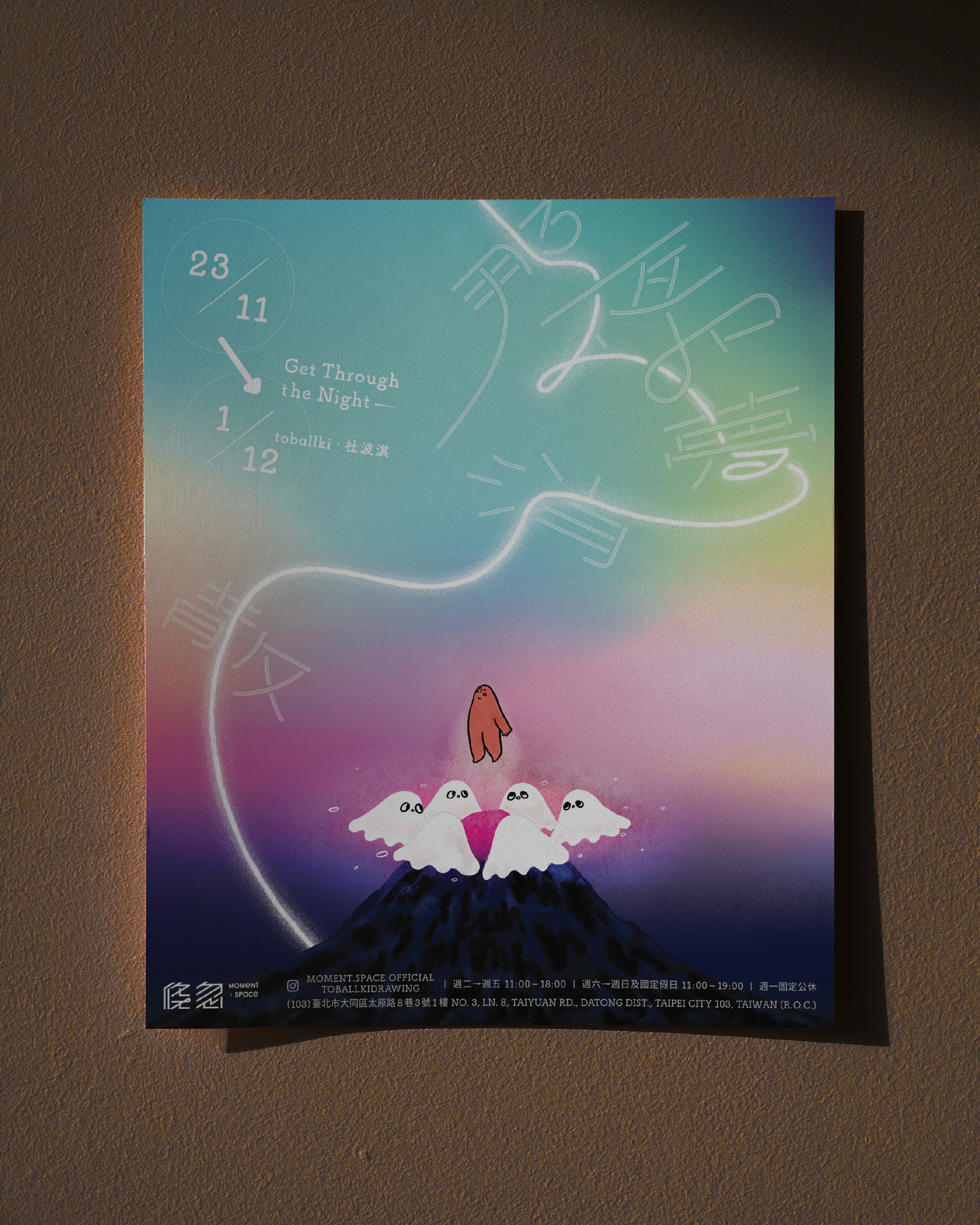
Exhibition-poster.JPG
exhibition-1.mp4
book-1.mp4
book-2.mp4
Get Through the Night
,
Poster, Book cover
,
2024
"Get Through the Night 那夜如夢消散" is the first overseas solo exhibition by Hong Kong illustrator toballkidrawing (杜波淇 / Toballki). Held at Moment Space in Taipei, the exhibition features her signature rounded, endearing characters — notably Chubbie (肥教主) and the accompanying ghost Sobo (幽幽). Through gentle illustrations and a limited-edition illustrated book, it explores themes of emotional healing, self-acceptance, and inner peace, offering a comforting bedtime narrative that embraces nighttime darkness with stored daytime light and universal warmth. For the exhibition "Get Through the Night 那夜如夢消散" by toballkidrawing, we developed the key visual and book cover design. The creative direction focused on highlighting the calmness, dreamy, and casual essence of the artist and her work. This resulted in a soft, sincere, and emotionally tender visual language that beautifully captures the exhibition’s soothing, introspective, and effortlessly warm atmosphere. Creative, Art Direction: Leo Mak
Exhibition-poster.JPG
exhibition-1.mp4
book-1.mp4
book-2.mp4
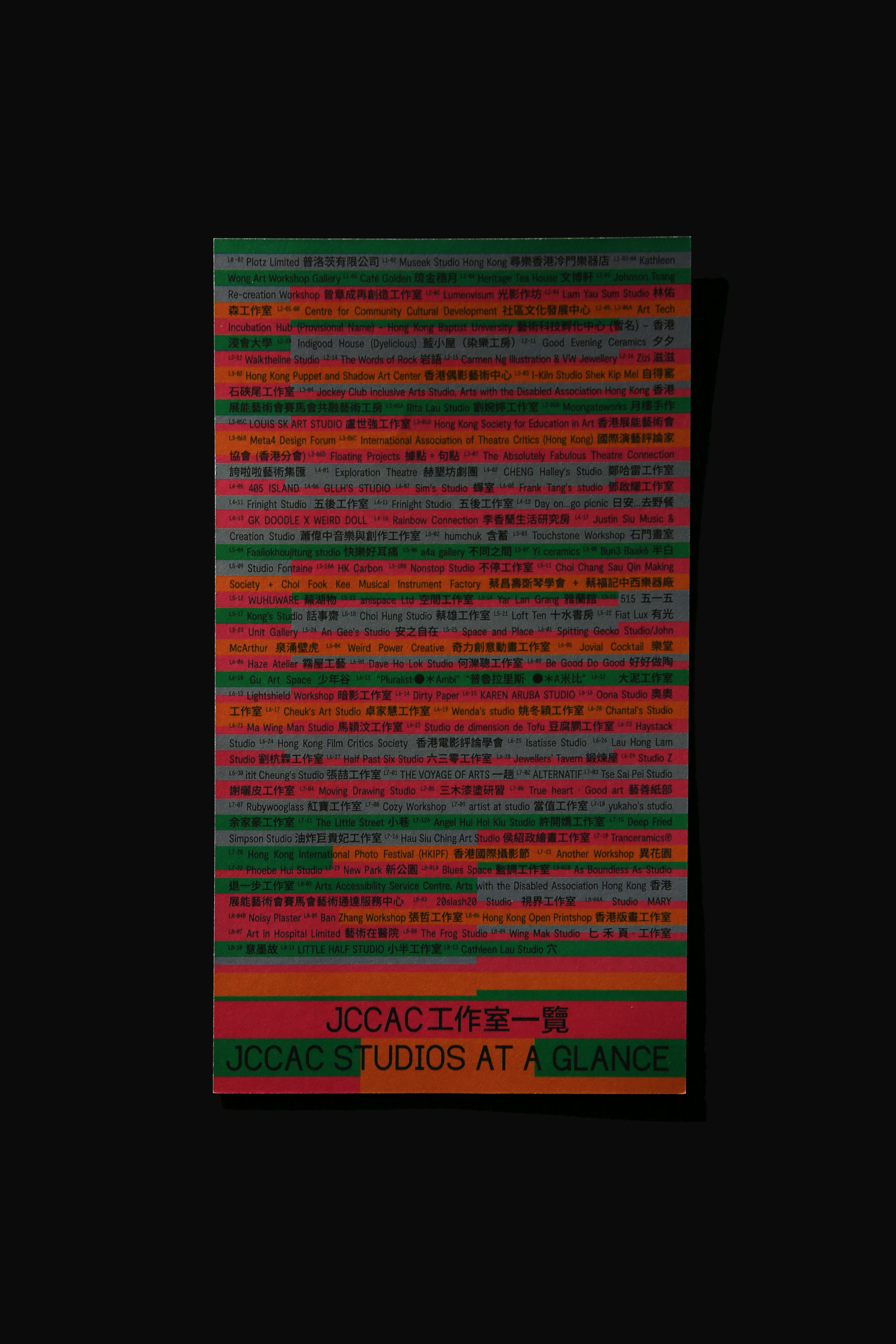
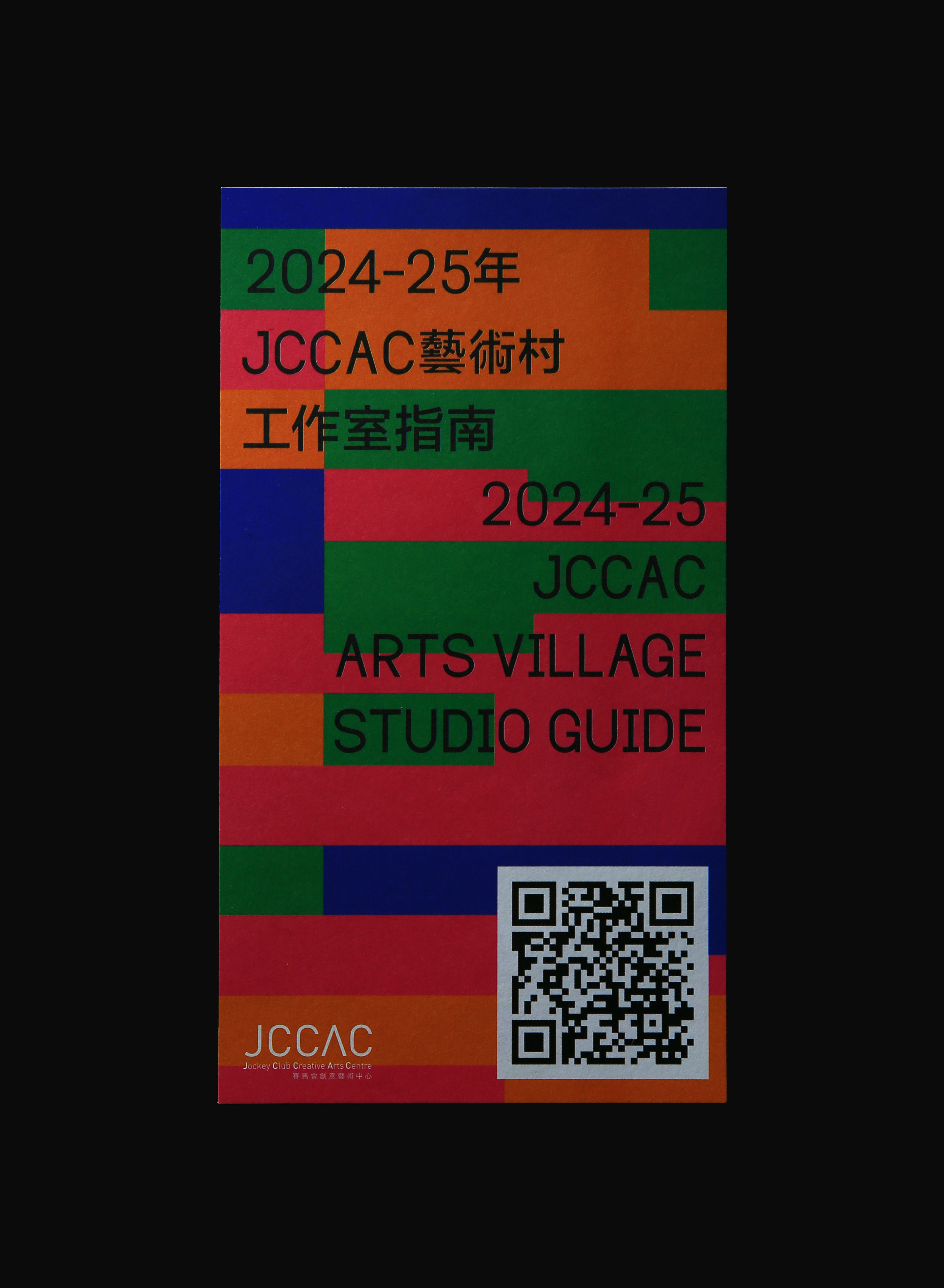
JCCAC Studio Guide 24/25
,
Animated Online Brochure
,
2024
The Jockey Club Creative Arts Centre (JCCAC) is Hong Kong’s pioneering vertical artist village and multi-disciplinary creative hub, located in Shek Kip Mei. Housed in a converted nine-storey former factory building (originally the Shek Kip Mei Factory Estate built in the 1970s), JCCAC opened in 2008 as one of the city’s earliest adaptive reuse projects. It provides over 100 artist studios and workspaces for more than 140 artists and cultural organisations, alongside galleries, a black-box theatre, workshops, and public programmes. Retaining its raw industrial architecture — exposed concrete, open courtyards, and authentic factory character — JCCAC embodies a grounded yet experimental space for independent and community-driven creative practice. For JCCAC’s 2024–25 season, we designed and produced a pioneering animated online studio guide. The creative direction focused on strengthening JCCAC’s experimental and grounded image while prominently highlighting its distinctive architectural features. Through dynamic animation, the guide creates a strong, memorable impression that authentically showcases the centre’s unique industrial heritage and successfully stands out to its audience. Creative, Art Direction: Leo Mak
animated-online-brochure.mp4
animated-online-brochure-2.mp4
flyer-art-basel-1.jpg
flyer-art-basel-2.jpg
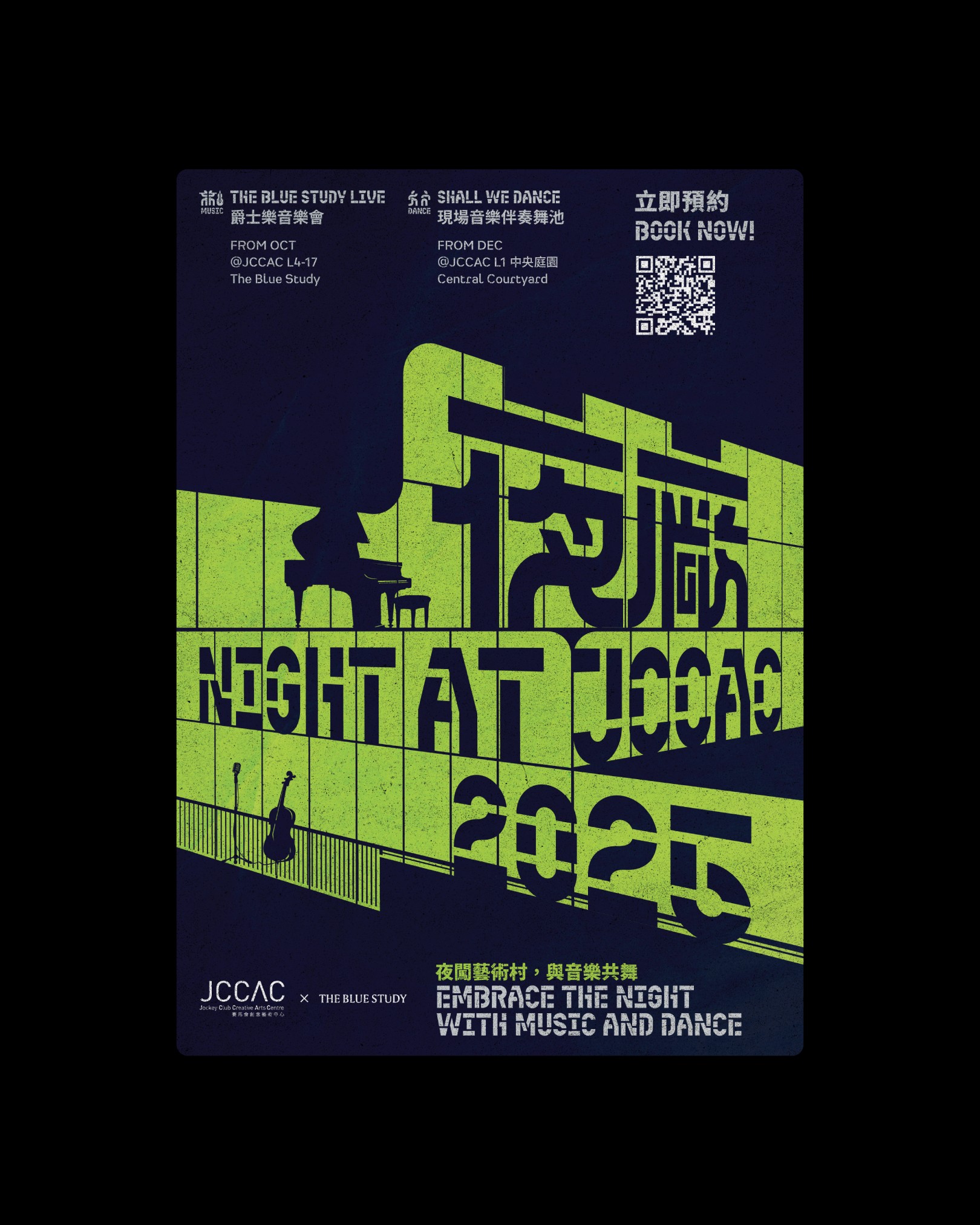
Night at JCCAC
,
Event Identity
,
2025
Night at JCCAC (夜廠JCCAC) is a new nighttime event series launched in 2025 by the Jockey Club Creative Arts Centre (JCCAC) in Shek Kip Mei, Hong Kong. Presented in collaboration with The Blue Study, the programme transforms the historic former factory artist village into a vibrant after-dark cultural destination. It features intimate live jazz concerts (The Blue Study Live), swing and dance nights, and other immersive music and arts experiences that activate JCCAC’s distinctive industrial architecture once the sun sets. Creative, Art Direction: Leo Mak
lights-up.mp4
poster.jpg
side tool
,
Identity
,
2023
Creative, Art Direction: Leo Mak
explainer.mp4
simple-brand-identity.mp4
side tool
,
Identity
,
2023
Creative, Art Direction: Leo Mak
explainer.mp4
simple-brand-identity.mp4
janthought
,
Identity
,
2024
janthought (also known as janthought studios) is a hybrid creative studio and production company founded in 2017 in Hong Kong. Based in Wah Tat Industrial Centre, Kwai Chung, the studio integrates expertise from creative agencies, design studios, and production houses to deliver end-to-end solutions in brand identity, creative direction, photography, and video production. Driven by bold vision and big ideas, janthought works with leading clients across tech, fashion, lifestyle, and contemporary art sectors, including Samsung, New Era x Starbucks, and Art Basel. For janthought, we developed a simple and cohesive brand identity. The clean, versatile design reflects the studio’s hybrid nature while maintaining a sharp, professional presence across all applications. Creative, Art Direction: Leo Mak
simple-brand-identity.mp4
teaser.mp4
The Twist of a Halo
,
Event Identity, Typography
,
2024
「迴曲 (The Twist of a Halo)」 was the solo exhibition by Hong Kong artist Kazy Chan (b. 1993), presented by JPS Gallery at Landmark Atrium, Central, Hong Kong from 19 July to 18 August 2024. In this body of work, Chan reinterprets the traditional halo — a symbol of divinity and perfection — through deliberate twisting and distortion. The exhibition featured paintings, his largest ceramic sculptures to date, and innovative mixed-media pieces, challenging fixed perceptions and inviting viewers to question established ideas of creativity, freedom, and inner truth. For the exhibition "迴曲 (The Twist of a Halo)" by Kazy Chan, we developed the simple event identity and designed the promotional flyer. Creative, Art Direction: Leo Mak
event-visual-a4-flyer.jpg
catalogue.jpg
The HK Phil Community Concert Series
,
Event Key Visual, Booklet
,
2023–Now
The HK Phil Community Concert is an ongoing outreach programme presented by the Hong Kong Philharmonic Orchestra (HK Phil). Launched in 2022 and continuing to the present, the series brings free classical music concerts to district venues across Hong Kong (such as Tuen Mun Town Hall, Yuen Long Theatre, and other community halls). Open to audiences of all ages and backgrounds with free admission by registration, the programme makes high-quality orchestral music accessible beyond traditional concert halls, fostering community engagement and sharing the joy of classical music with the wider public. For the HK Phil Community Concert series from 2022 to the present, we developed a series of key visuals and designed the house programme booklets. Creative, Art Direction: Leo Mak Illustration: toballki @toballkidrawing
2025.mp4
2025.jpg

2026.jpg
2026-2.jpg
2024.jpg
The HK Phil Community Concert Series
,
Event Key Visual, Booklet
,
2023–Now
The HK Phil Community Concert is an ongoing outreach programme presented by the Hong Kong Philharmonic Orchestra (HK Phil). Launched in 2022 and continuing to the present, the series brings free classical music concerts to district venues across Hong Kong (such as Tuen Mun Town Hall, Yuen Long Theatre, and other community halls). Open to audiences of all ages and backgrounds with free admission by registration, the programme makes high-quality orchestral music accessible beyond traditional concert halls, fostering community engagement and sharing the joy of classical music with the wider public. For the HK Phil Community Concert series from 2022 to the present, we developed a series of key visuals and designed the house programme booklets. Creative, Art Direction: Leo Mak Illustration: toballki @toballkidrawing
2025.mp4
2025.jpg
2026.jpg
2026-2.jpg
2024.jpg
Edko Films Poster Series
,
Poster, Typography
,
2022–2024
Edko Films Ltd. (安樂影片有限公司) is one of Hong Kong’s longest-established and most respected film production and distribution companies. Founded in 1959 by Kong Cho-yee and led since 1989 by his son, William Kong (Bill Kong), Edko has distributed over 1,500 titles in Hong Kong and mainland China. The company is known for bringing both major commercial blockbusters and acclaimed art-house/international films to local audiences, including titles such as Lust, Caution, Brokeback Mountain, Pan’s Labyrinth, and many award-winning works. Edko also operates the Broadway Cinematheque arthouse cinema chain and plays a key role in film promotion and exhibition across the region. For Edko Films Ltd. from 2022 to 2024, we designed a series of posters and created adaptations for their film releases. Creative, Art Direction: Leo Mak
Afire.mp4
Afire-2.jpg
evil-doesnt-exist-1.jpg
evil-doesnt-exist-2.jpg
ennio-1.mp4
ennio-2.jpg
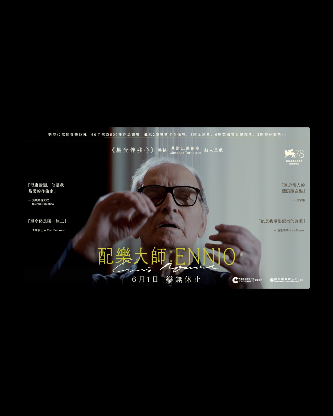
ennio-3.jpg
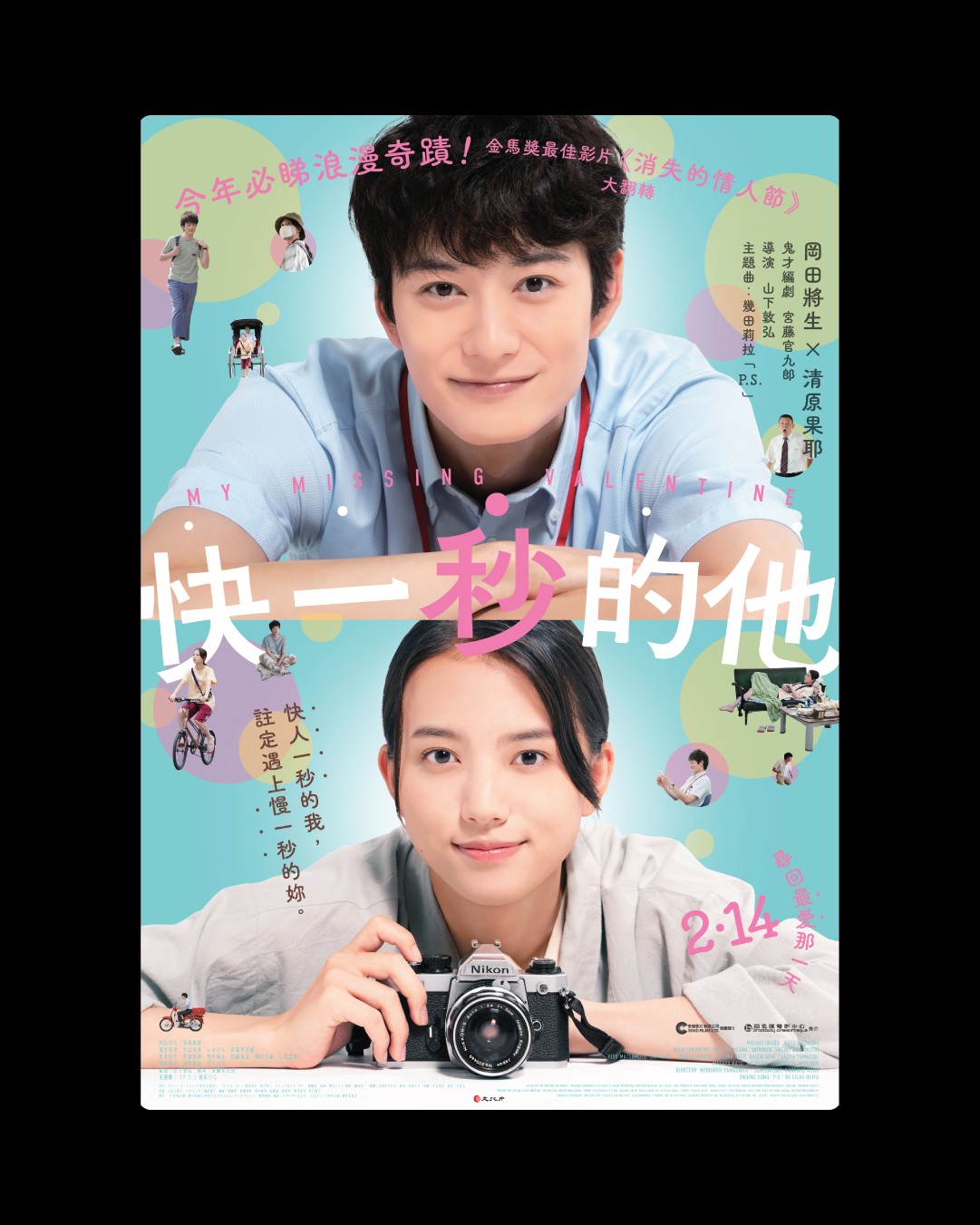
my-missing-valentine.jpg
Edko Films Poster Series
,
Poster, Typography
,
2022–2024
Edko Films Ltd. (安樂影片有限公司) is one of Hong Kong’s longest-established and most respected film production and distribution companies. Founded in 1959 by Kong Cho-yee and led since 1989 by his son, William Kong (Bill Kong), Edko has distributed over 1,500 titles in Hong Kong and mainland China. The company is known for bringing both major commercial blockbusters and acclaimed art-house/international films to local audiences, including titles such as Lust, Caution, Brokeback Mountain, Pan’s Labyrinth, and many award-winning works. Edko also operates the Broadway Cinematheque arthouse cinema chain and plays a key role in film promotion and exhibition across the region. For Edko Films Ltd. from 2022 to 2024, we designed a series of posters and created adaptations for their film releases. Creative, Art Direction: Leo Mak
Afire.mp4
Afire-2.jpg
evil-doesnt-exist-1.jpg
evil-doesnt-exist-2.jpg
ennio-1.mp4
ennio-2.jpg
ennio-3.jpg
my-missing-valentine.jpg
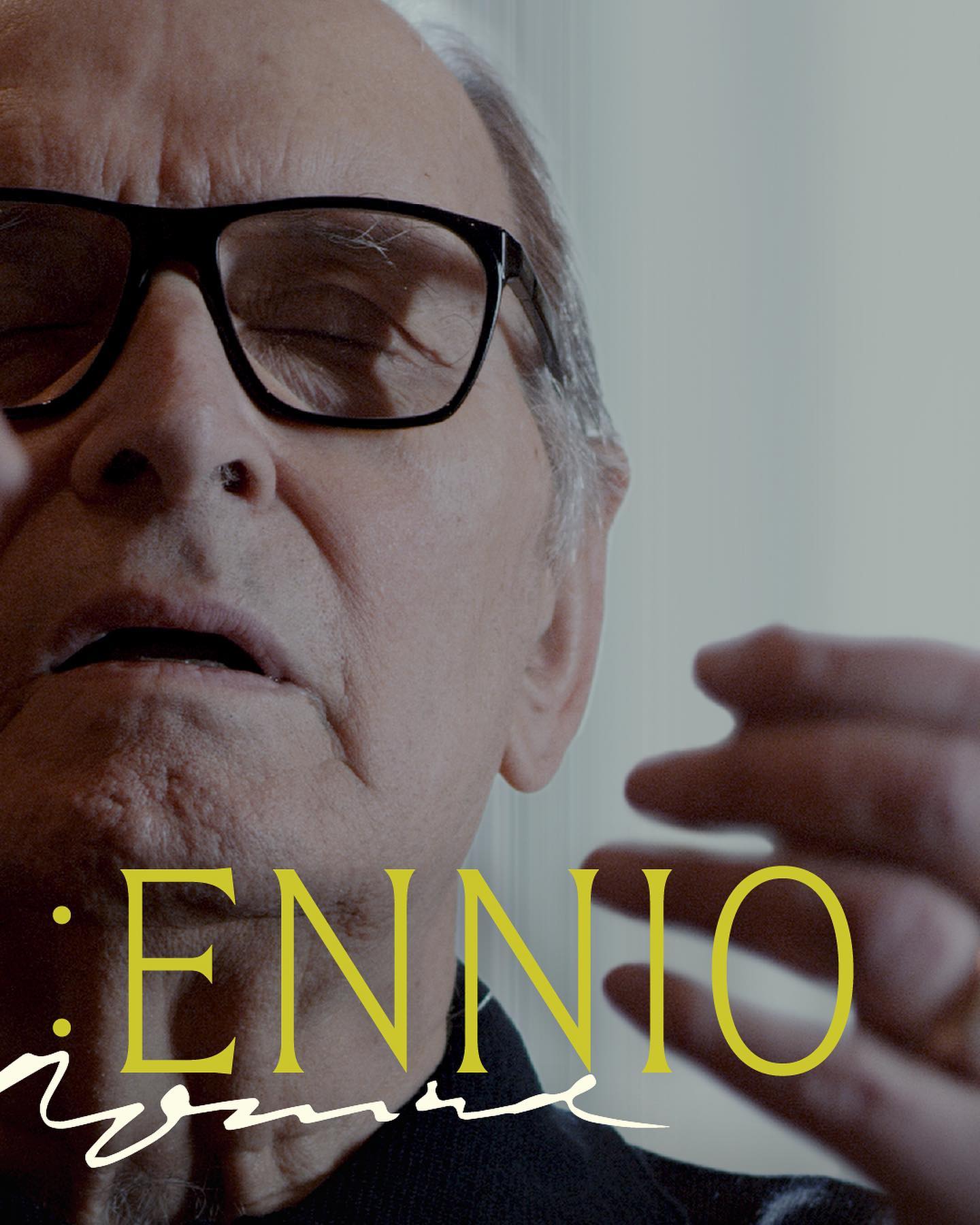
Ennio Morricone: A Retrospective
,
Event Identity, Booklet
,
2023
“Ennio Morricone: A Retrospective” (安尼奧摩利哥尼作品展) was a special film programme presented by Broadway Cinematheque in collaboration with the Italian Cultural Institute Hong Kong. Held from 20 April to 20 May 2023 at Broadway Cinematheque (Yau Ma Tei) and Premiere Elements, the retrospective celebrated the legendary Italian composer Ennio Morricone by screening a curated selection of 13 classic and cult films featuring his iconic scores, alongside the documentary Ennio. For the event “Ennio Morricone: A Retrospective” held by Broadway Cinematheque, we developed the event identity and designed the programme booklet. Creative, Art Direction: Leo Mak

morricone-poster.jpg
morricone-booklet.mp4

morricone-booklet-inner-page-poster.jpg
Ennio Morricone: A Retrospective
,
Event Identity, Booklet
,
2023
“Ennio Morricone: A Retrospective” (安尼奧摩利哥尼作品展) was a special film programme presented by Broadway Cinematheque in collaboration with the Italian Cultural Institute Hong Kong. Held from 20 April to 20 May 2023 at Broadway Cinematheque (Yau Ma Tei) and Premiere Elements, the retrospective celebrated the legendary Italian composer Ennio Morricone by screening a curated selection of 13 classic and cult films featuring his iconic scores, alongside the documentary Ennio. For the event “Ennio Morricone: A Retrospective” held by Broadway Cinematheque, we developed the event identity and designed the programme booklet. Creative, Art Direction: Leo Mak
morricone-poster.jpg
morricone-booklet.mp4
morricone-booklet-inner-page-poster.jpg
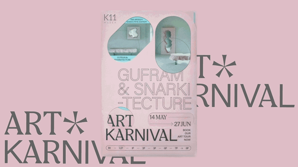
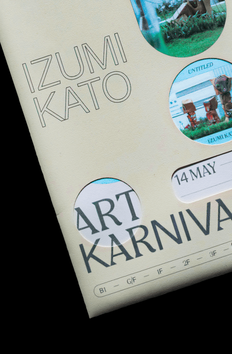
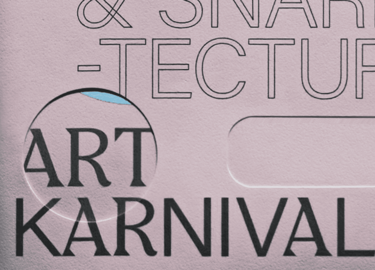
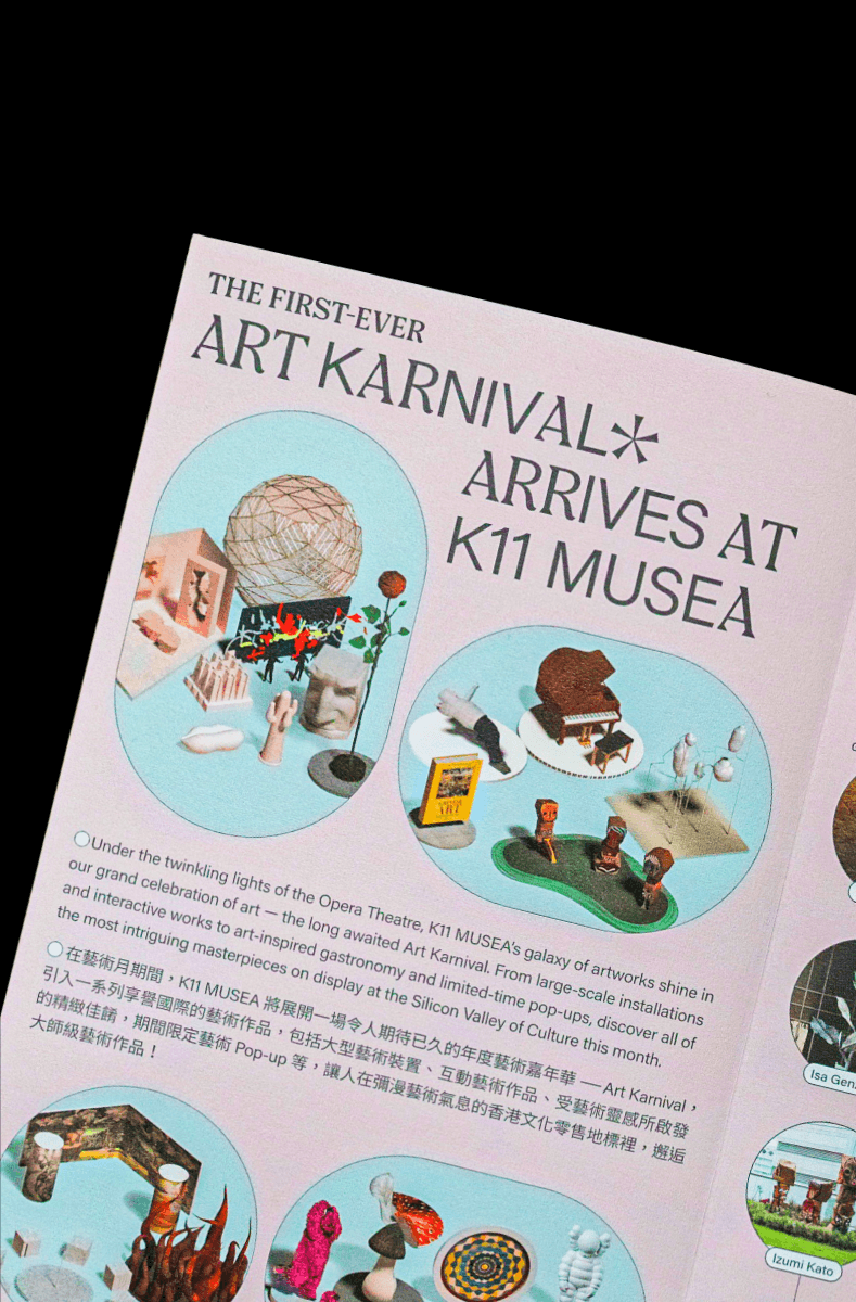
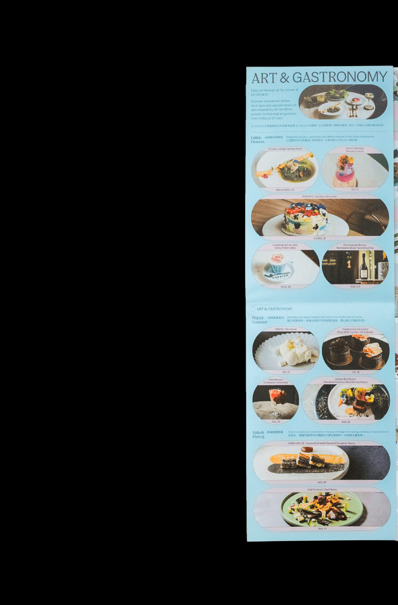
K11 Art Karnival 2021
,
Event Identity
,
2021
K11 Art Karnival is the annual flagship art festival presented by K11 MUSEA at Victoria Dockside, Tsim Sha Tsui, Hong Kong. As a major highlight of Hong Kong Art Month, the event transforms the cultural-retail destination into a vibrant, immersive art playground. It features large-scale installations, interactive artworks, exhibitions by local and international artists, limited pop-ups, art-inspired gastronomy, performances, and guided tours — bridging contemporary art, commerce, and community in an engaging and accessible way. For K11 Art Karnival presented by K11 MUSEA, we developed the event identity and designed the art programme map. Director: Edward Chiu @edwardjohnsebastian @cement.werkstatt Creative, Art Direction: Leo Mak, Son Mok @MINUS Creative
brochure-variation.gif

poster-close-up.gif
full-digital-screen.mp4
art-map.mp4
art-map.jpg
art-map-2.jpg
art-map-3.jpg
art-map-4.jpg
art-map-5.jpg
K11 Art Karnival 2021
,
Event Identity
,
2021
K11 Art Karnival is the annual flagship art festival presented by K11 MUSEA at Victoria Dockside, Tsim Sha Tsui, Hong Kong. As a major highlight of Hong Kong Art Month, the event transforms the cultural-retail destination into a vibrant, immersive art playground. It features large-scale installations, interactive artworks, exhibitions by local and international artists, limited pop-ups, art-inspired gastronomy, performances, and guided tours — bridging contemporary art, commerce, and community in an engaging and accessible way. For K11 Art Karnival presented by K11 MUSEA, we developed the event identity and designed the art programme map. Director: Edward Chiu @edwardjohnsebastian @cement.werkstatt Creative, Art Direction: Leo Mak, Son Mok @MINUS Creative
brochure-variation.gif
poster-close-up.gif
full-digital-screen.mp4
art-map.mp4
art-map.jpg
art-map-2.jpg
art-map-3.jpg
art-map-4.jpg
art-map-5.jpg
A Very MUSEA Christmas
,
Event Identity
,
2021
“A Very MUSEA Christmas” (also known as “Have a Very MUSEA Christmas”) is the annual flagship Christmas festival presented by K11 MUSEA at Victoria Dockside, Tsim Sha Tsui, Hong Kong. The large-scale seasonal programme transforms the entire art-and-culture destination into a magical winter wonderland, featuring immersive artistic installations, a Christmas Village pop-up market with curated local and international brands, gourmet experiences, festive performances, and special collaborations (including major partnerships such as Dior). Running from late November through early January each year, it has become one of Hong Kong’s most anticipated holiday events, blending art, culture, retail, and celebration. For “A Very MUSEA Christmas” presented by K11 MUSEA, we developed the event identity, designed the advent calendar, created multiple adaptations, and produced Out-of-Home advertising campaigns. Director: Edward Chiu @edwardjohnsebastian @cement.werkstatt Creative, Art Direction: Leo Mak, Son Mok @MINUS Creative

event-lockup-overview.gif
advent-caldendar-1.jpg
advent-caldendar-2.jpg
advent-caldendar-3.jpg
campaign-overview-1.jpg
A Very MUSEA Christmas
,
Event Identity
,
2021
“A Very MUSEA Christmas” (also known as “Have a Very MUSEA Christmas”) is the annual flagship Christmas festival presented by K11 MUSEA at Victoria Dockside, Tsim Sha Tsui, Hong Kong. The large-scale seasonal programme transforms the entire art-and-culture destination into a magical winter wonderland, featuring immersive artistic installations, a Christmas Village pop-up market with curated local and international brands, gourmet experiences, festive performances, and special collaborations (including major partnerships such as Dior). Running from late November through early January each year, it has become one of Hong Kong’s most anticipated holiday events, blending art, culture, retail, and celebration. For “A Very MUSEA Christmas” presented by K11 MUSEA, we developed the event identity, designed the advent calendar, created multiple adaptations, and produced Out-of-Home advertising campaigns. Director: Edward Chiu @edwardjohnsebastian @cement.werkstatt Creative, Art Direction: Leo Mak, Son Mok @MINUS Creative
event-lockup-overview.gif
advent-caldendar-1.jpg
advent-caldendar-2.jpg
advent-caldendar-3.jpg
campaign-overview-1.jpg
K11 MUSEROOM
,
Event Identity
,
2020
K11 MUSEROOM (also known as MUSE ROOMS) is an immersive art and design experience programme presented by K11 MUSEA at Victoria Dockside, Hong Kong. The programme transforms the cultural-retail destination into a series of themed “Muse Rooms” through creative collaborations with international artists, designers, and lifestyle brands. Each room offers a unique, dreamlike environment that blends contemporary art, interactive installations, and experiential design, inviting visitors to explore imagination, creativity, and cultural narratives engagingly and memorably. For the event “K11 MUSEROOM” presented by K11 MUSEA, we developed the event identity and designed the official brochure. Director: Edward Chiu @edwardjohnsebastian @cement.werkstatt Creative, Art Direction: Leo Mak
teaser.mp4
museroom-brochure.mp4
K11 VILLA MUSEA
,
Event Identity
,
2021
K11 VILLA MUSEA was a major immersive summer programme presented by K11 MUSEA at Victoria Dockside, Tsim Sha Tsui, Hong Kong, from July to September 2021. Inspired by the glamour and elegance of Italy’s Lake Como, the event transformed the entire art-and-culture destination into a picturesque lakeside villa. It offered a rich calendar of experiences including the MUSEA CLASSIC classic car exhibition, Campari pop-up bar, opera screenings, live performances, artistic installations, and luxury lifestyle activations — creating an elegant summer getaway that blended contemporary art, culture, design, and leisure. For the event “K11 VILLA MUSEA” presented by K11 MUSEA, we developed the event identity, designed the phone case, posters, and created the official booklet. Director: Edward Chiu @edwardjohnsebastian @cement.werkstatt Creative, Art Direction: Leo Mak, Son Mok @MINUS Creative
event-lockup-overview.gif
phone-case-and-booklet.mp4
side-event-poster.mp4
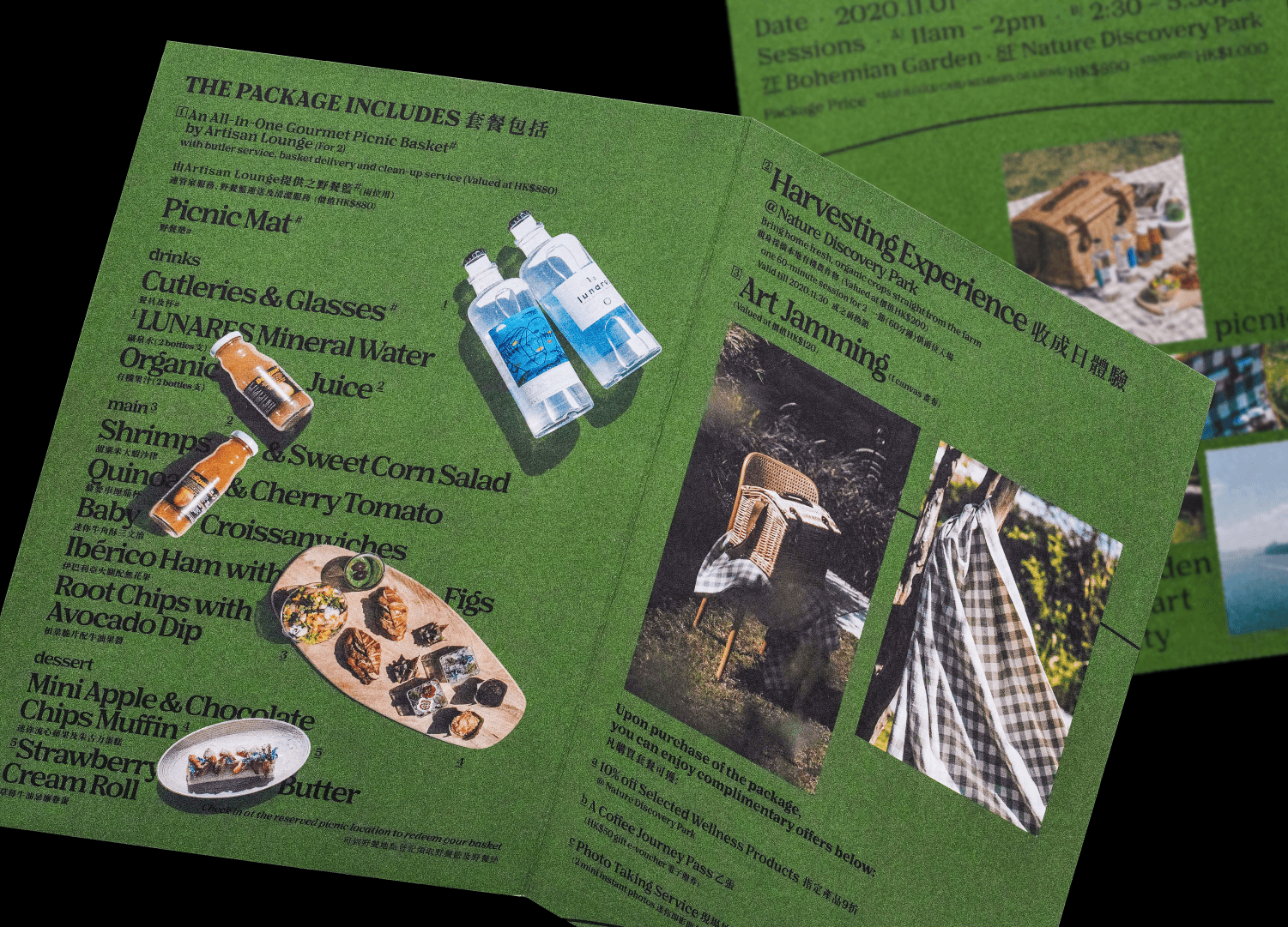
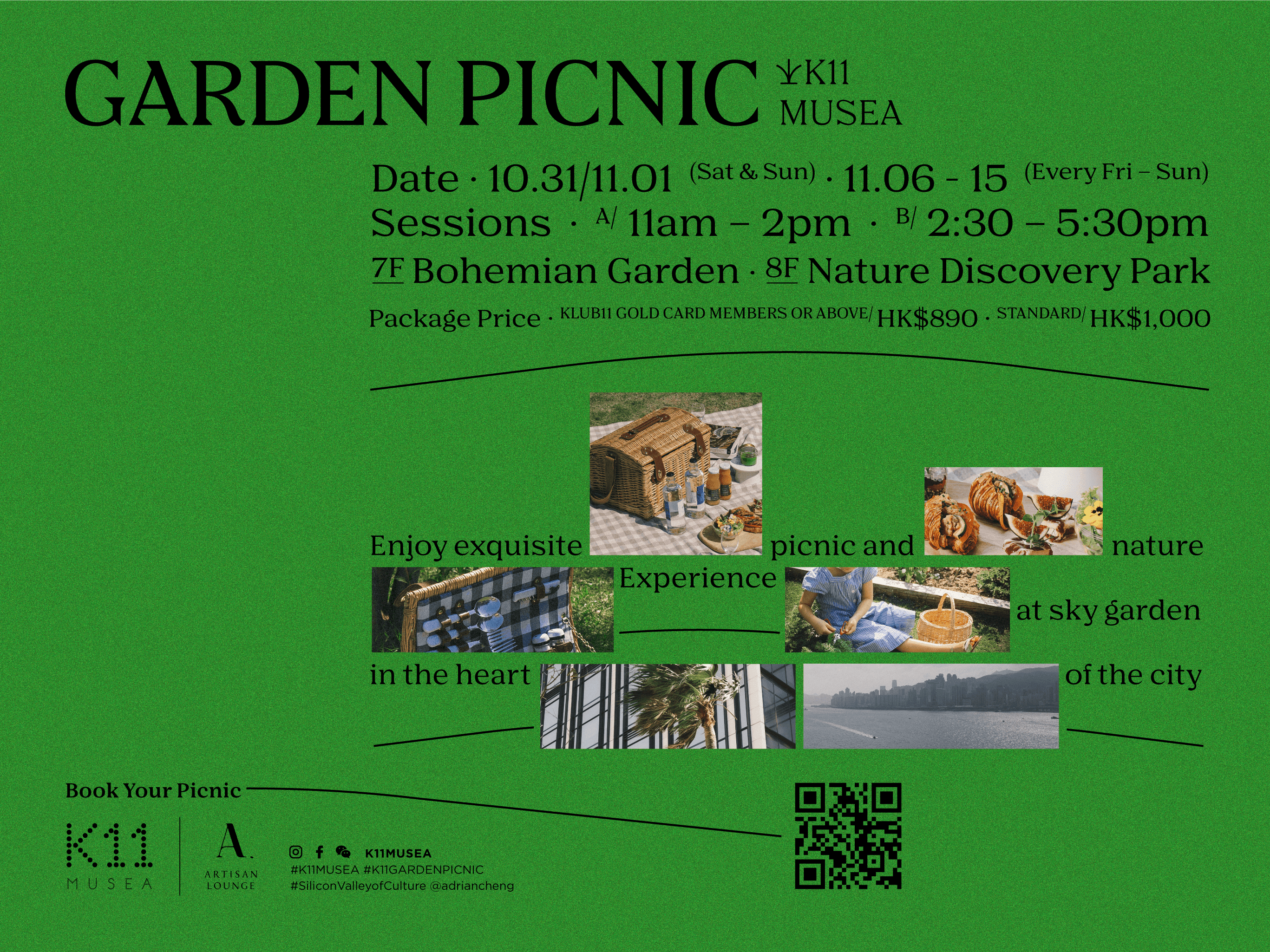
Garden Picnic
,
Event Identity
,
2021
K11 Garden Picnic is a relaxed lifestyle event series presented by K11 MUSEA at its rooftop Bohemian Garden and Nature Discovery Park in Victoria Dockside, Tsim Sha Tsui, Hong Kong. The event transforms the lush green spaces into an idyllic urban picnic destination, offering gourmet picnic baskets, alfresco dining, family-friendly activities, and a blend of nature, gastronomy, and contemporary leisure in one of the city’s most scenic cultural-retail destinations. For K11 Garden Picnic presented by K11 MUSEA, we developed the event identity and designed the flyer. Director: Edward Chiu @edwardjohnsebastian @cement.werkstatt Creative, Art Direction: Leo Mak, Son Mok @MINUS Creative

event-lockup-overview.gif

event-lockup-overview-2.gif
flyer.jpg
flyer-2.jpg
Garden Picnic
,
Event Identity
,
2021
K11 Garden Picnic is a relaxed lifestyle event series presented by K11 MUSEA at its rooftop Bohemian Garden and Nature Discovery Park in Victoria Dockside, Tsim Sha Tsui, Hong Kong. The event transforms the lush green spaces into an idyllic urban picnic destination, offering gourmet picnic baskets, alfresco dining, family-friendly activities, and a blend of nature, gastronomy, and contemporary leisure in one of the city’s most scenic cultural-retail destinations. For K11 Garden Picnic presented by K11 MUSEA, we developed the event identity and designed the flyer. Director: Edward Chiu @edwardjohnsebastian @cement.werkstatt Creative, Art Direction: Leo Mak, Son Mok @MINUS Creative
event-lockup-overview.gif
event-lockup-overview-2.gif
flyer.jpg
flyer-2.jpg